Go where the work happens.
Field visits, ride-alongs and interviews before screens. The constraint people mention last is usually the one that matters most.

I spent five years building tools for people working on social equity.
I stop to stare at old buildings.
I build things people lean on without noticing they're there.
I'm a designer, strategist and product manager. I spent almost five years on the founding team at Ooloi Labs, growing from its first product designer into its PM, building software for social-impact work. I like turning messy, human systems into tools people actually use.
 Strategy
Field visits, ride-alongs and interviews before screens. The constraint people mention last is usually the one that matters most.

Architecture taught me to map flows and edges before designing a single room. I still start every product problem that way.

Put something real in front of people early, then let their use, not our opinions, decide what grows.
A creative with expertise in product management & design, and experience in leading cross-functional teams to deliver impactful, user-centred solutions. I am eager to build on my experience developing innovative technology products and services that are accessible, intuitive, and designed to bridge social and systemic gaps.
I take products from fuzzy problem to shipped feature: field research and synthesis, systems and service mapping, product strategy and roadmaps, and hands-on interface design in Figma. At Parsons I added futures methods, workshop facilitation and sustainability strategy. I'm comfortable prototyping in code when it gets an idea in front of people faster.
Mapped the South Asia market and profiled target investors to support fundraising, then ran a targeted outreach campaign across ~300 prospects for a clean-tech air purifier.
Led a five-person cross-functional team through roadmaps, sprint planning and prioritisation, launching 5+ projects across water equity, justice, health and education.
Shipped a self-serve platform builder, a real-time annotation system and a white-label design system, and built a B2B knowledge management platform for internal teams and partner organisations.
Took 5+ residential interior projects from brief to delivery, and drafted technical drawings, bills of quantity and cost estimates for institutional and government work.
For Winks, a speculative memory product for mindful reflection, in Figma’s first national design competition (170+ students, 60+ teams).
A configuration suite that lets non-technical teams build, govern and personalise an entire platform, without filing a ticket.
The Open Knowledge Framework is a modular platform for research, learning management, data collection and visualisation. It was powerful, but every act of configuration, from a new content template to new languages, permissions or a redesigned homepage, needed a developer.
As it scaled across clients, the dev team was buried in customisation tickets while trying to ship features. Product owners waited in line to change things they understood better than anyone.
The team was rebuilding the backend and frontend while fielding a steady stream of one-off configuration requests.
Product owners and admins knew their tenants, content and users best, but had no direct way to act on that knowledge.
The old admin dashboard had shallow, hard-to-read structure, with navigation and analytics bolted onto the header. Fixing it meant restructuring the information, not restyling it.
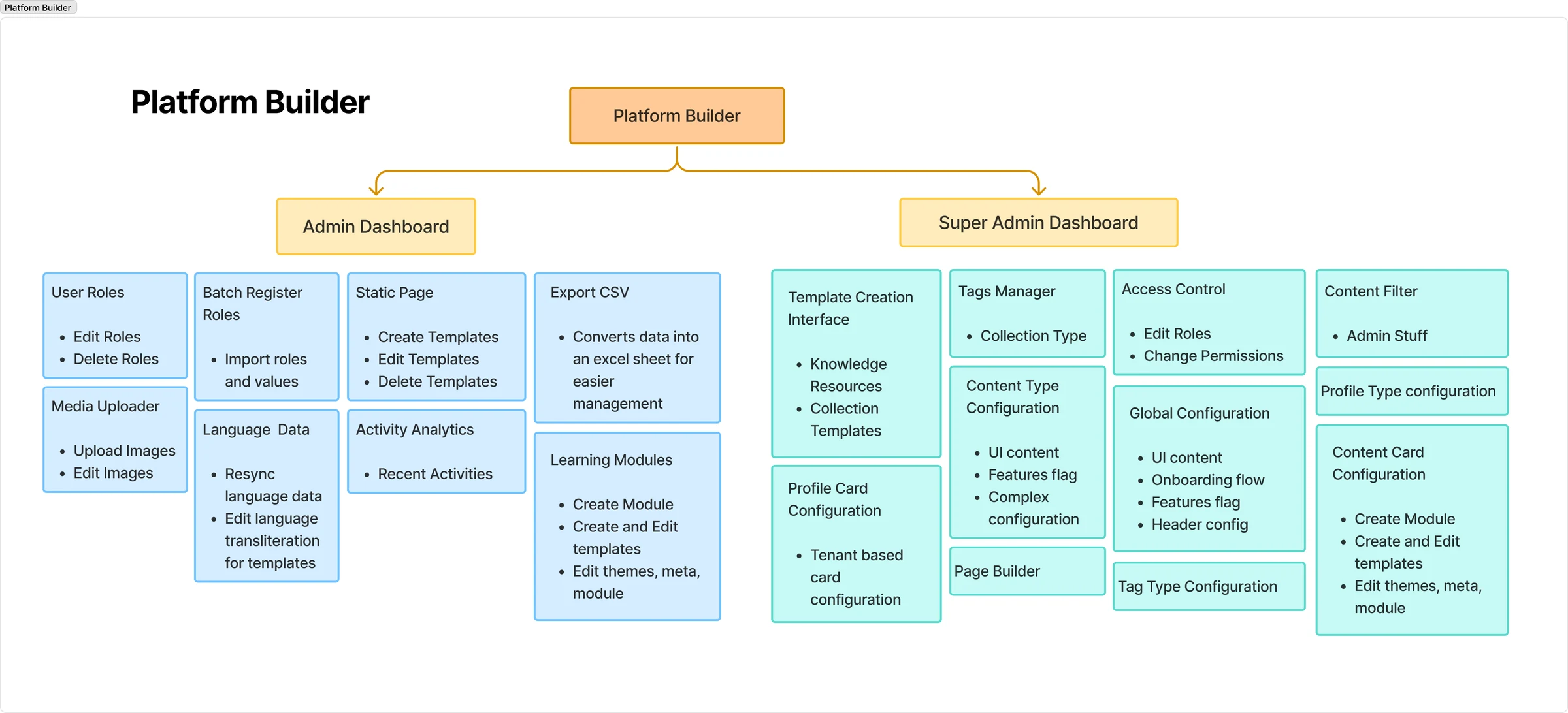
We listed every function the existing dashboard exposed, then interviewed the development and strategy teams about what customising the platform really took: the tasks, the skills, and how much control each role needed. Two questions ran through all of it: what should be client-facing, and who gets to control what.
We also studied CRM, ERP and data-management products, where many connected services are governed from one interface. That research became the backbone of a new information architecture: a map of every function that could safely move from developers to admins.
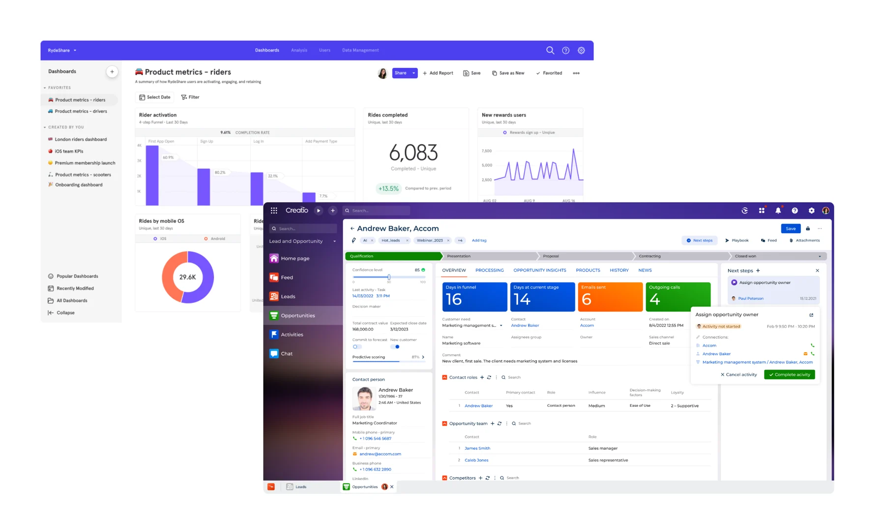
Instead of keeping the admin dashboard as a separate surface, we folded it into the Platform Builder: one suite, one mental model, seven areas to govern.
Control was split between an Admin dashboard and a Super Admin dashboard, so the same kind of setting lived in different places depending on who was allowed to change it.
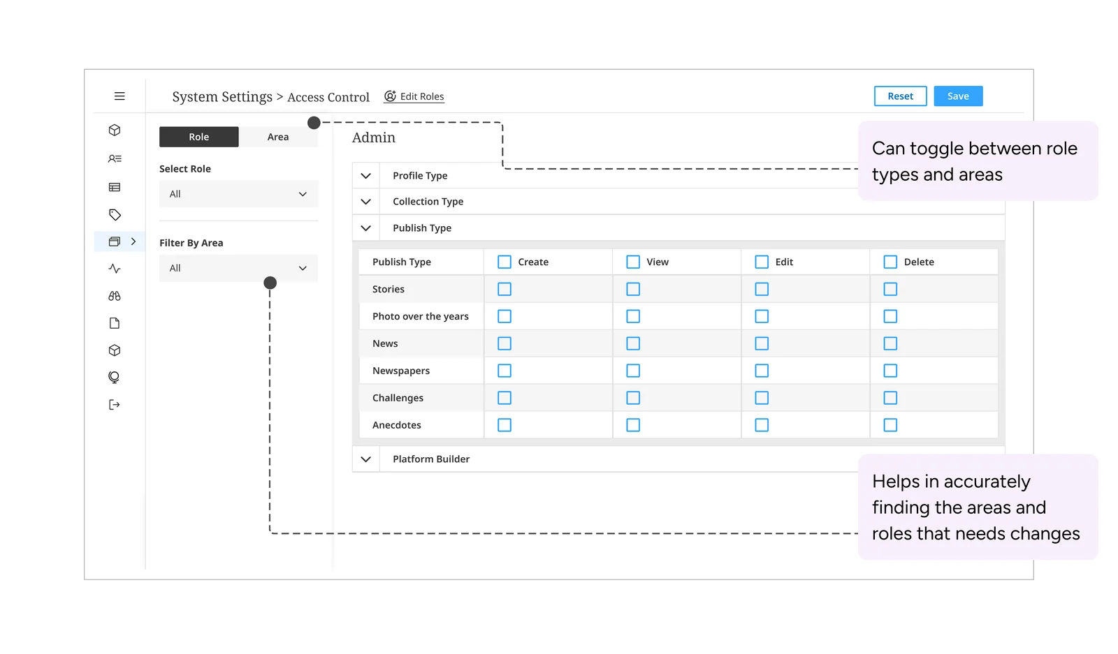
We restructured everything into seven areas: user settings, content templates, tags manager, system, global configuration, page builder and learning modules. Roles now decide access within each area instead of deciding which dashboard you open.
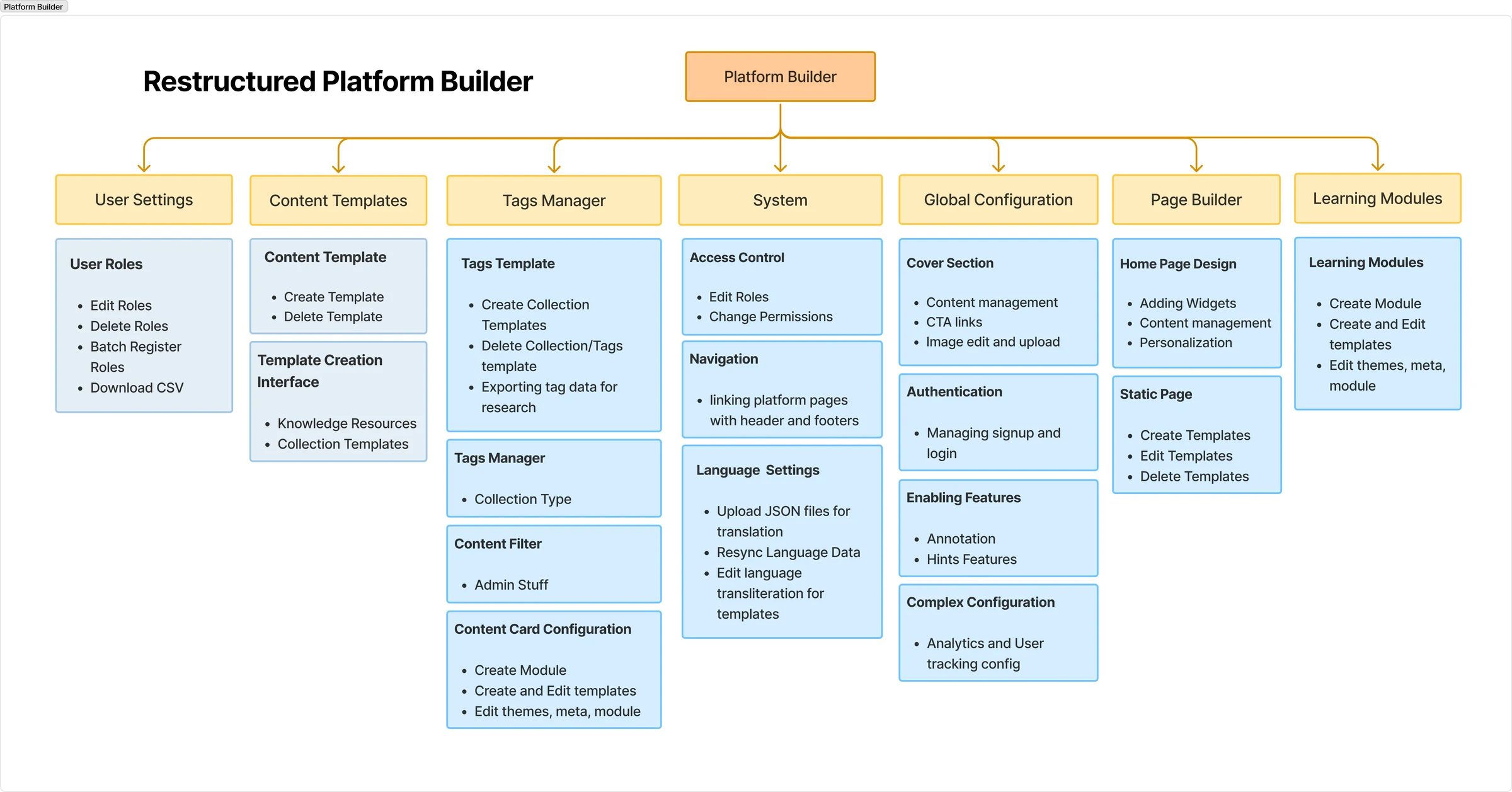
Each area was designed so a non-technical admin could run it with confidence, and every one follows the same pattern, which makes the suite learnable instead of a set of separate tools.
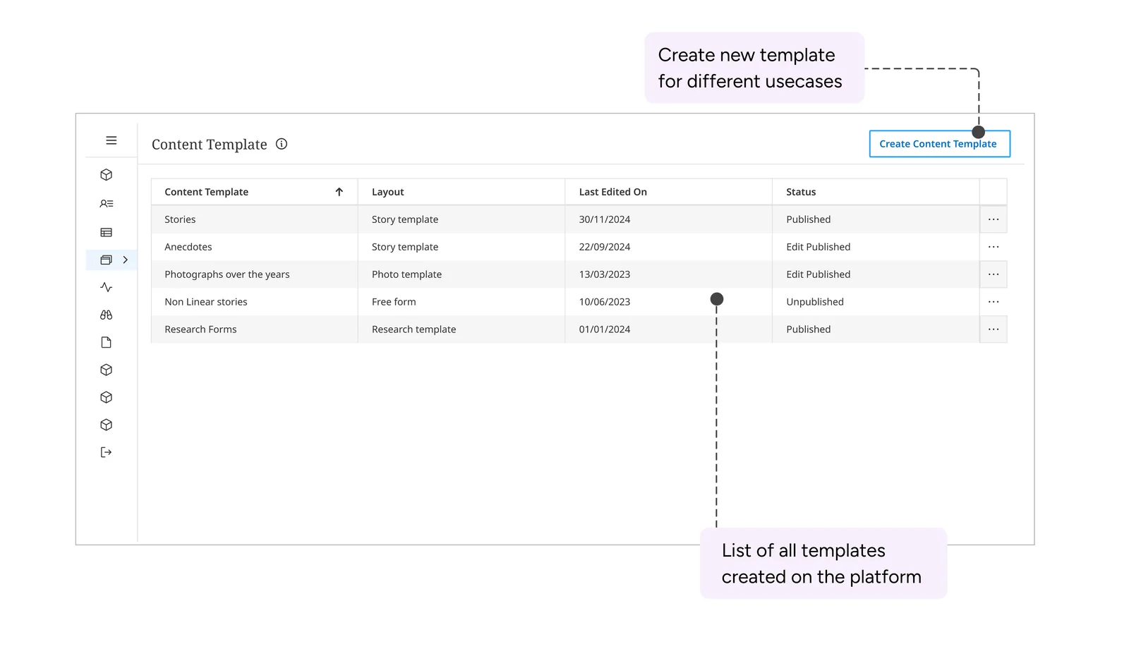
Admins start from a list of every template on the platform and create new ones for each use case.
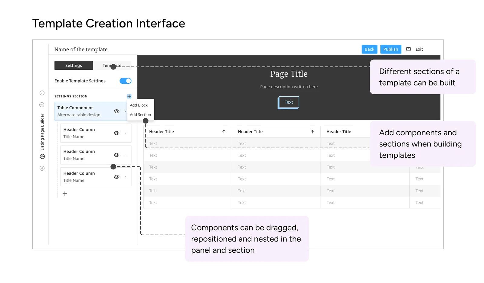
The heart of the build. Admins compose forms and pages from blocks and sections, dragging, repositioning and nesting components in a side panel while a live preview updates beside it. Template-making stopped being a developer task.
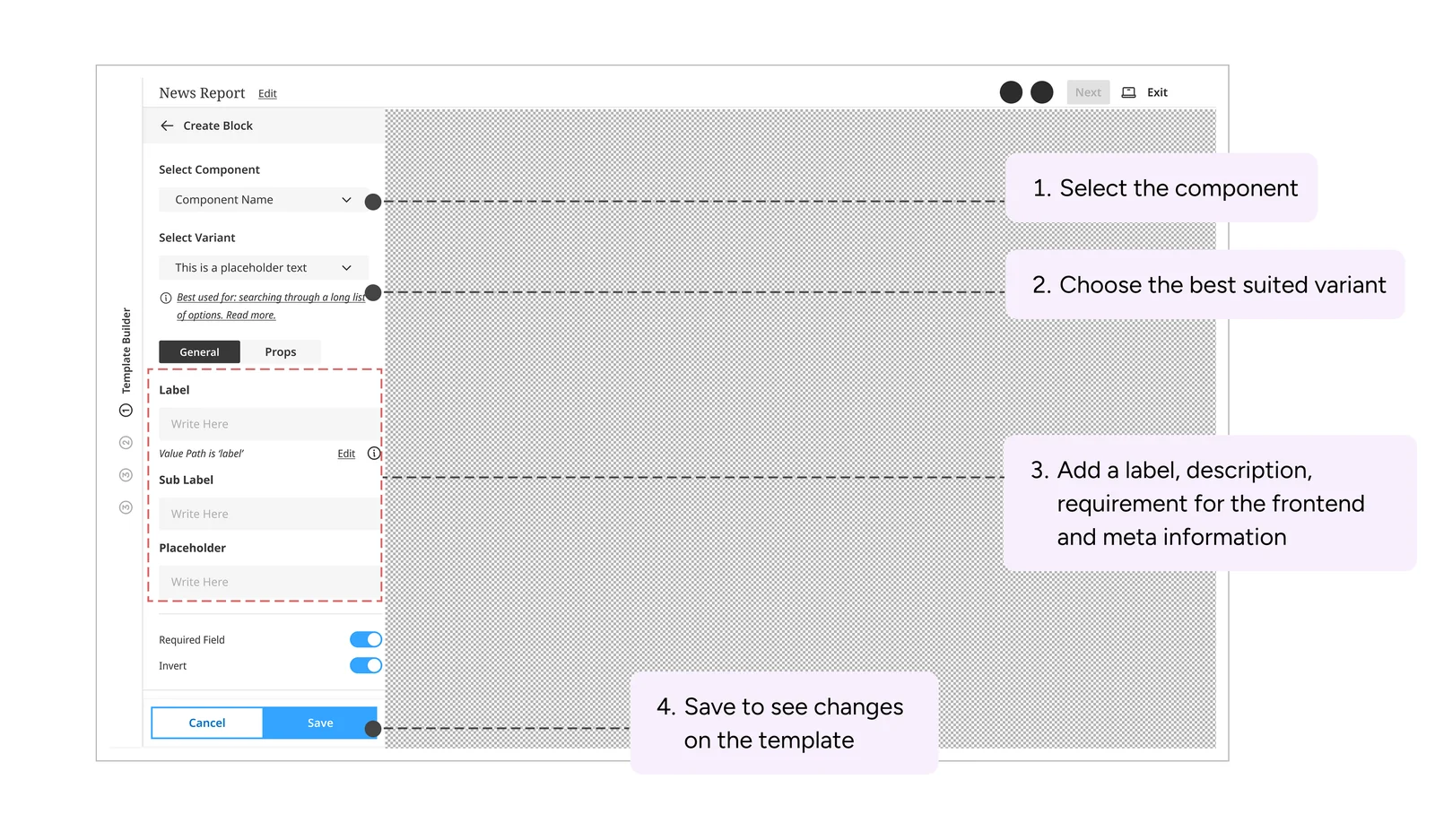
Adding a block always takes the same four steps:
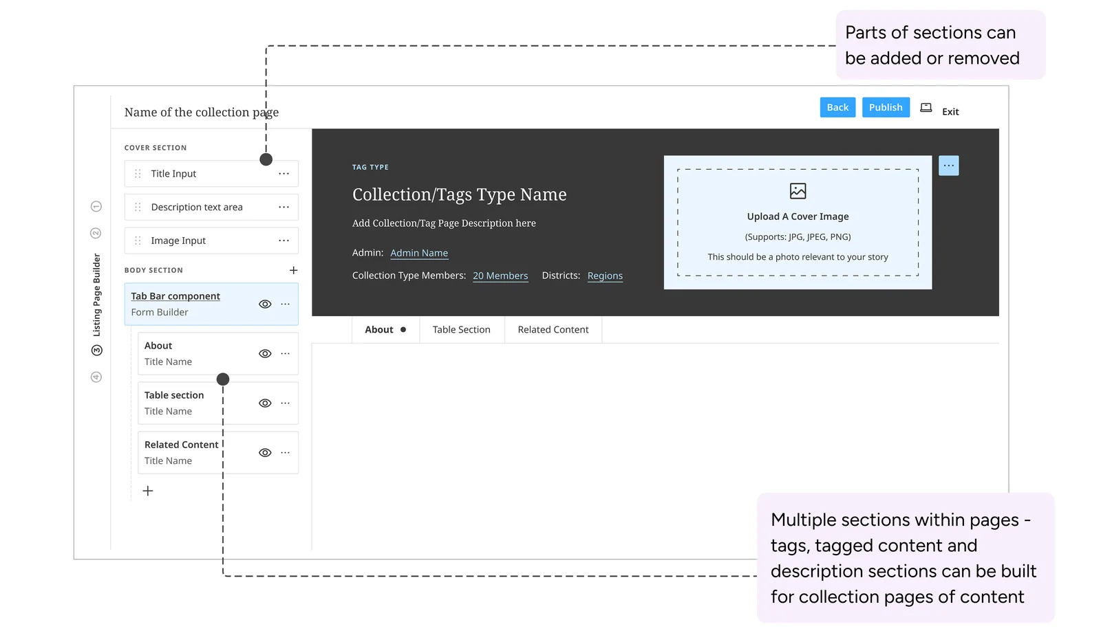
Admins assemble the pages that group tagged content: a cover, a description and tabs for related material, with parts added or removed as needed.
Detailed control over who can do what, how the site is navigated and how it looks.
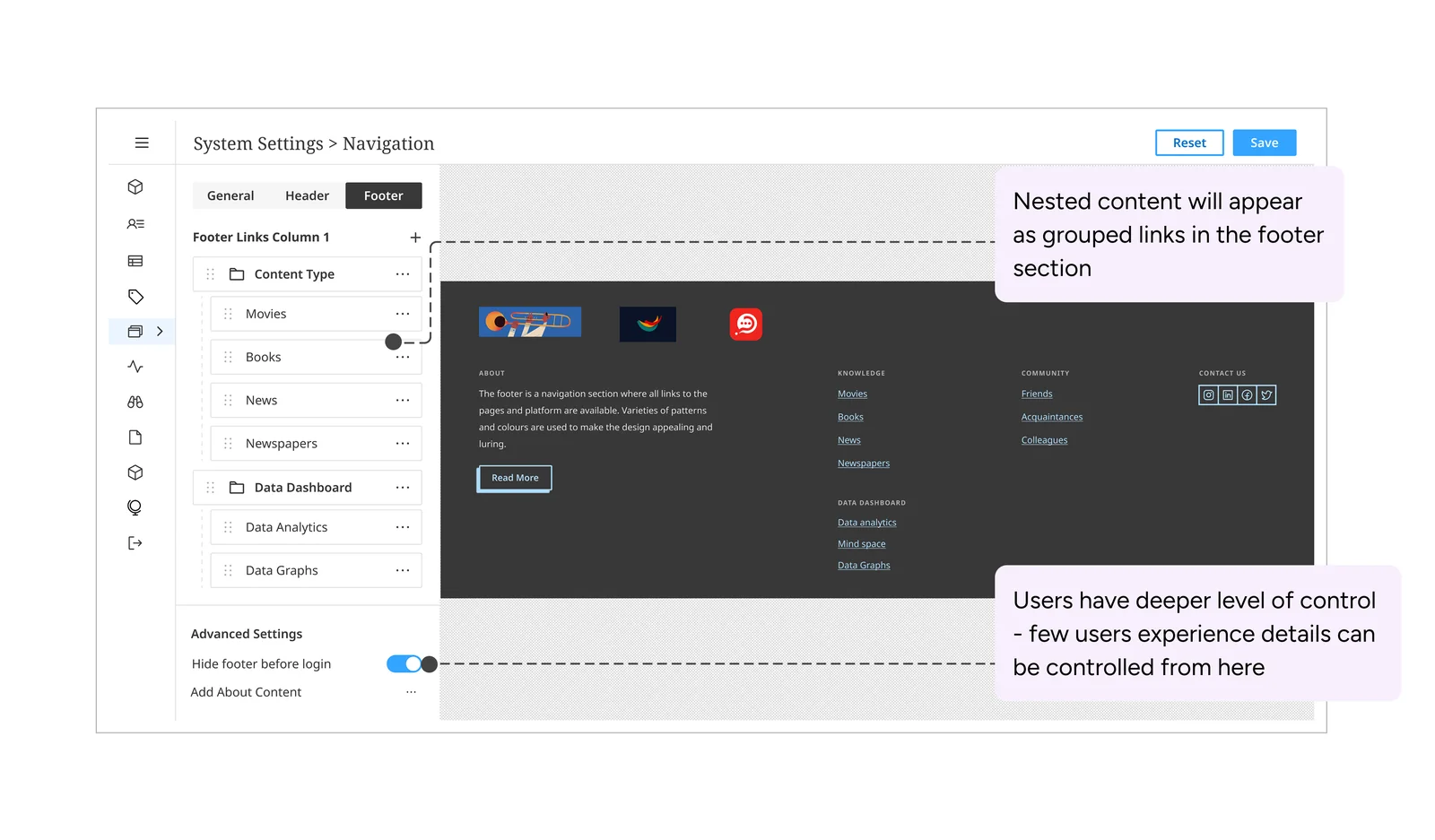
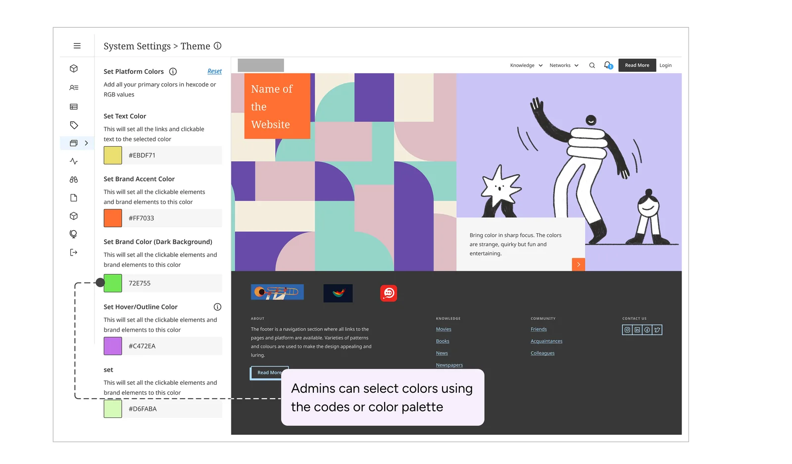
Authentication, feature toggles and complex settings moved out of scattered places into one panel. A single user dashboard handles adding people one at a time or in bulk, assigning roles and exporting records.
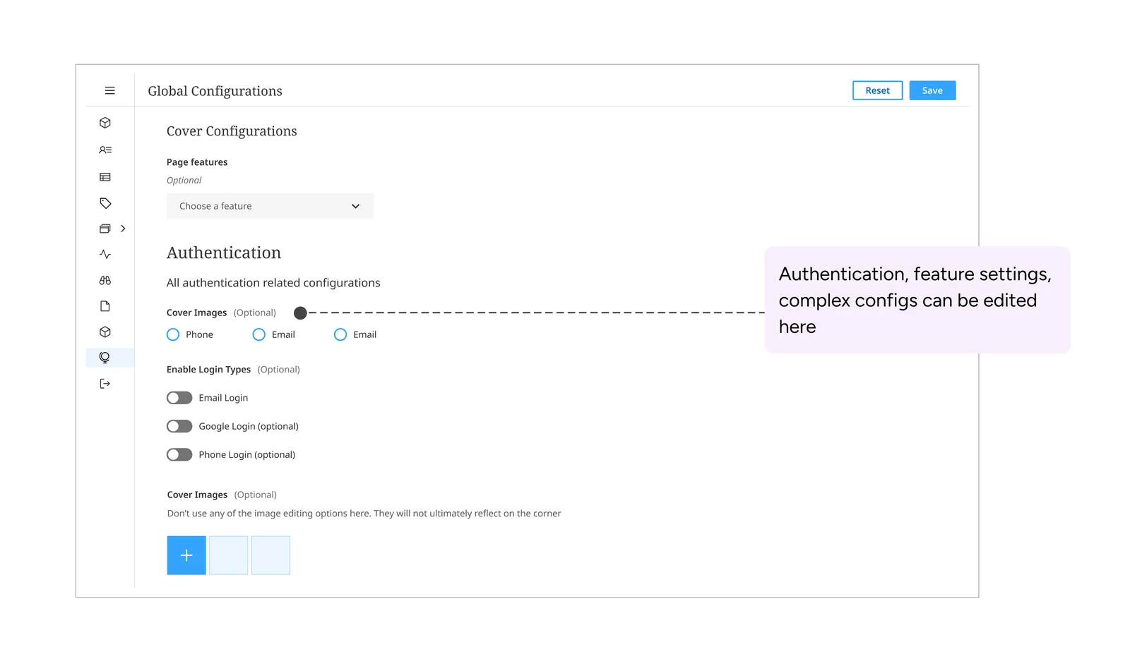
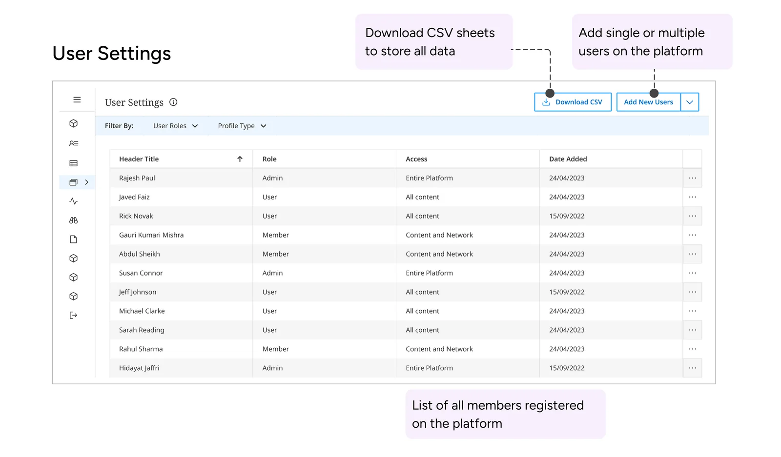
We tested each area first with the strategy and development teams, then with every client and tenant owner, until using it felt natural. Then we handed it to the Strategy and Planning team.
Within a week of onboarding, admins who had never written code were creating templates, changing features and editing access control themselves.
What used to need a ticket and a wait now took a few clicks and an afternoon.
"A good system doesn't just do the work; it redistributes the ability to do the work."
Every area had to be powerful enough to be useful and constrained enough to be safe in non-technical hands. That tension between control and guardrails is the real design problem in any self-serve tool.
How the suite holds up beyond seven areas, opinionated defaults so admins don't face a blank canvas, and previews that show what a configuration change will affect before it ships.
Field researchers tag and sort interview notes as they write them, instead of days later at a desk.
The Open Knowledge Framework (now DOTS) gives NGO field researchers forms to collect and transcribe interviews, across many kinds of social-impact work. What they still lacked was a way to label and synthesise what they collected.
Researchers transcribed, structured, categorised and then layered in their insights, and every feedback round on the analysis made it longer. On large field studies they needed to tag and sort inside the app, as they worked.


Three questions guided us:
We interviewed 20 interviewers working on programmes in sexual health, reproductive rights, watershed management and social justice. We also looked at how Google Docs, Medium and Notion handle annotation, and which ideas were worth borrowing.
Interviewers invented their own labels for quotes and local vernacular. The vocabulary already existed; it lived in their heads.
Transcription, shorthand and labelling happened at the same time, so switching between them had to be instant.
Program officers, interviewed at scale, needed to report directly from their applications.
We sketched user flows, moved into low-fidelity wireframes, ran a heuristic review and tried several tagging approaches before settling on one tuned to the research template. The core flow has four steps:
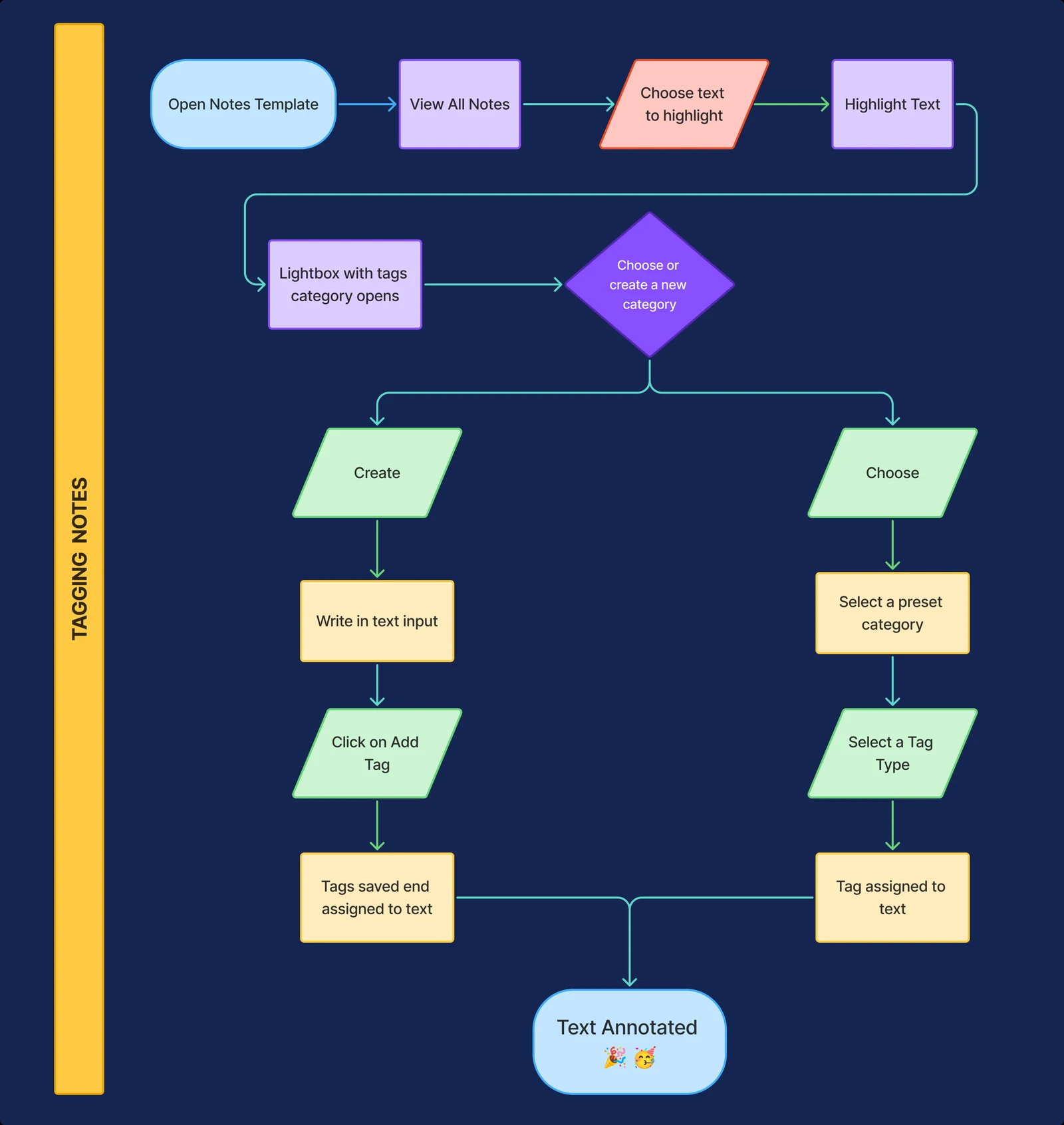
Mobile explorations of three different flows for adding a tag to a note: creating a new one, searching for one, and choosing from a preset list.
A docked field above the keyboard filters existing tags as you type and offers “Create” inline when nothing matches, so making a new tag never leaves the flow.
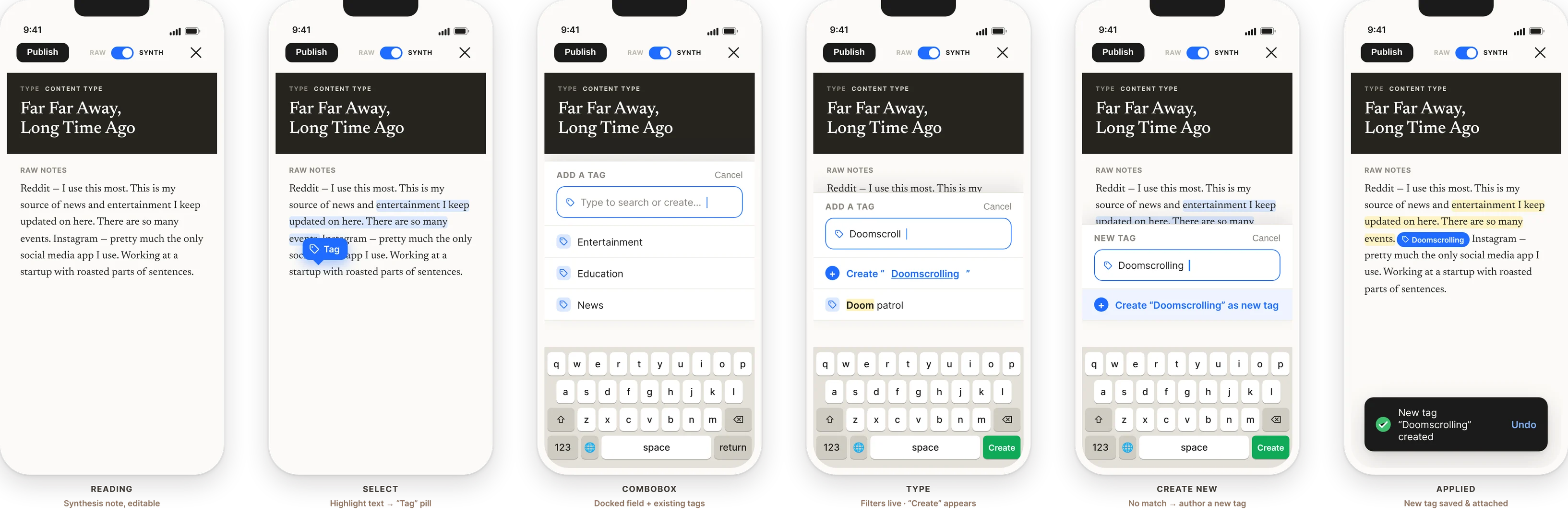
A dedicated full-screen picker with its own search field, so finding the right tag in a long list takes a couple of keystrokes.
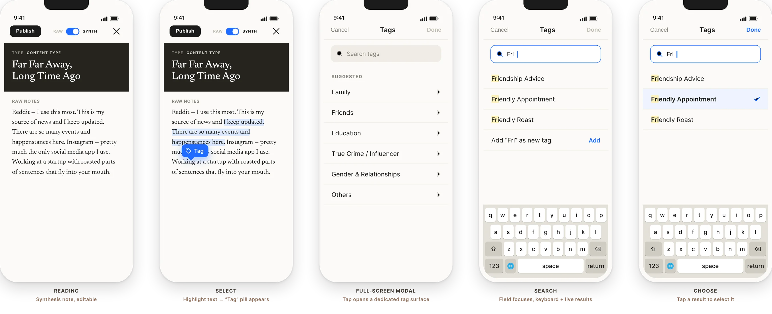
A bottom sheet keeps the passage in view while you pick a category, choose up to five options and apply them in one go.
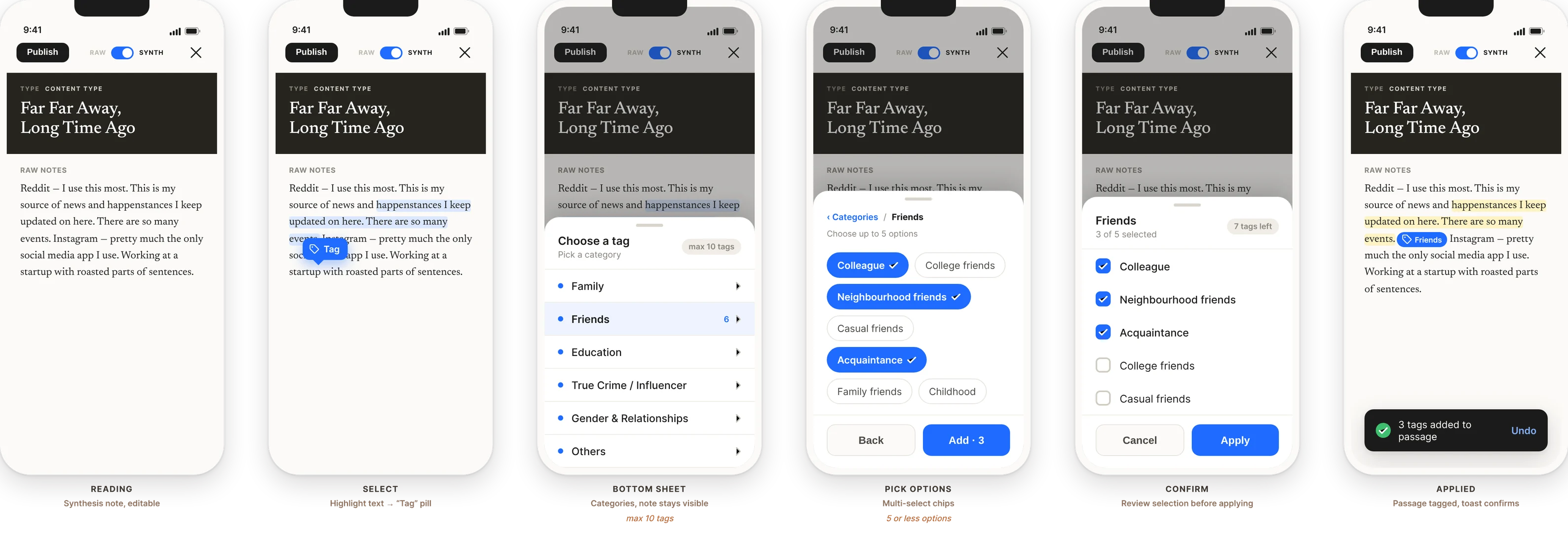
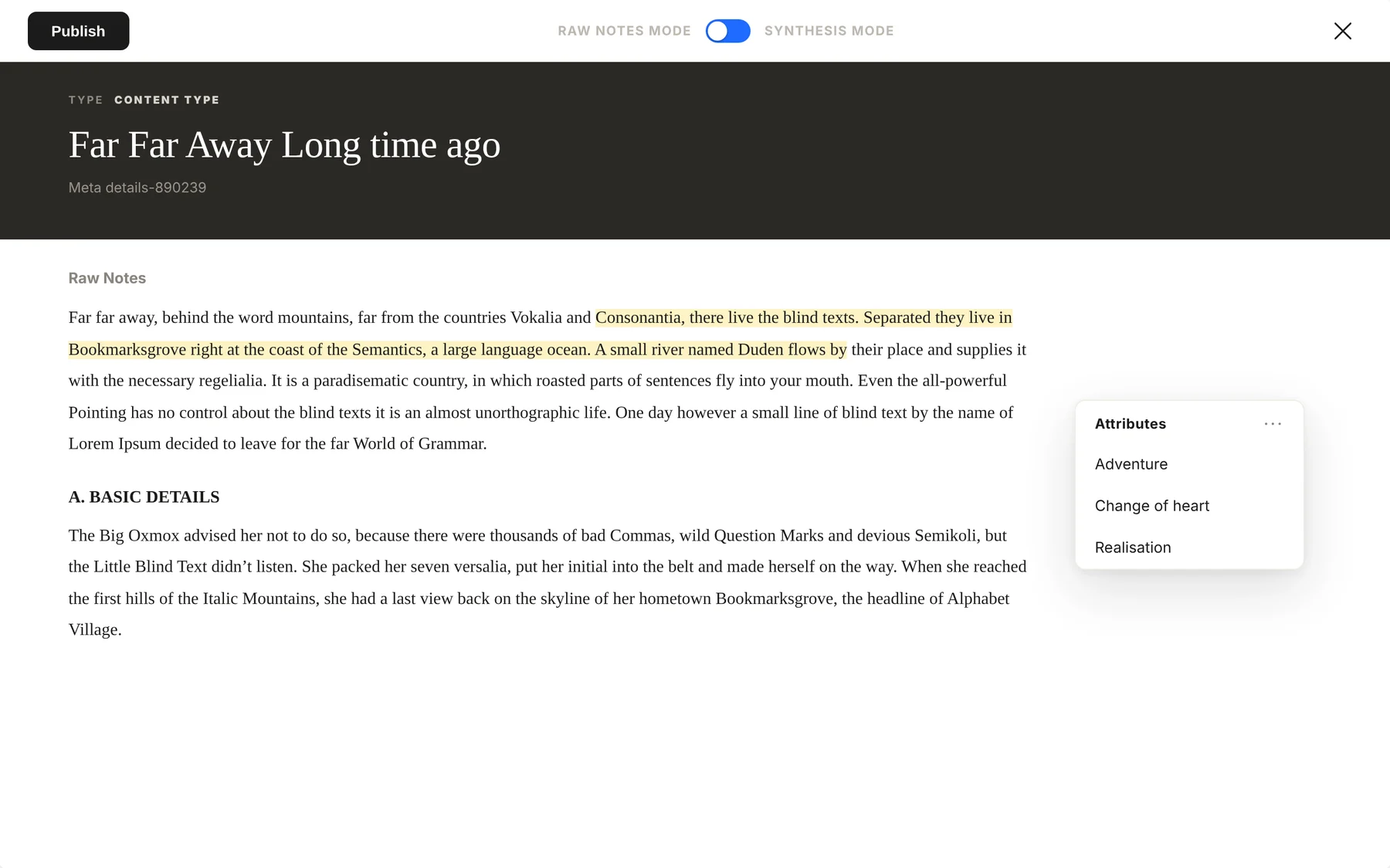
On desktop: highlight a passage, choose Annotate, pick a category and its attributes, and apply. Hover a tagged passage to review its attributes.
Interviewers write notes and transcripts, highlight a passage and open the tag menu. Choosing a tag assigns it to the selection, and they can create a new tag inside any category, so the taxonomy grows with the research. Tagged text is highlighted straight away, and hovering it shows its attributes.
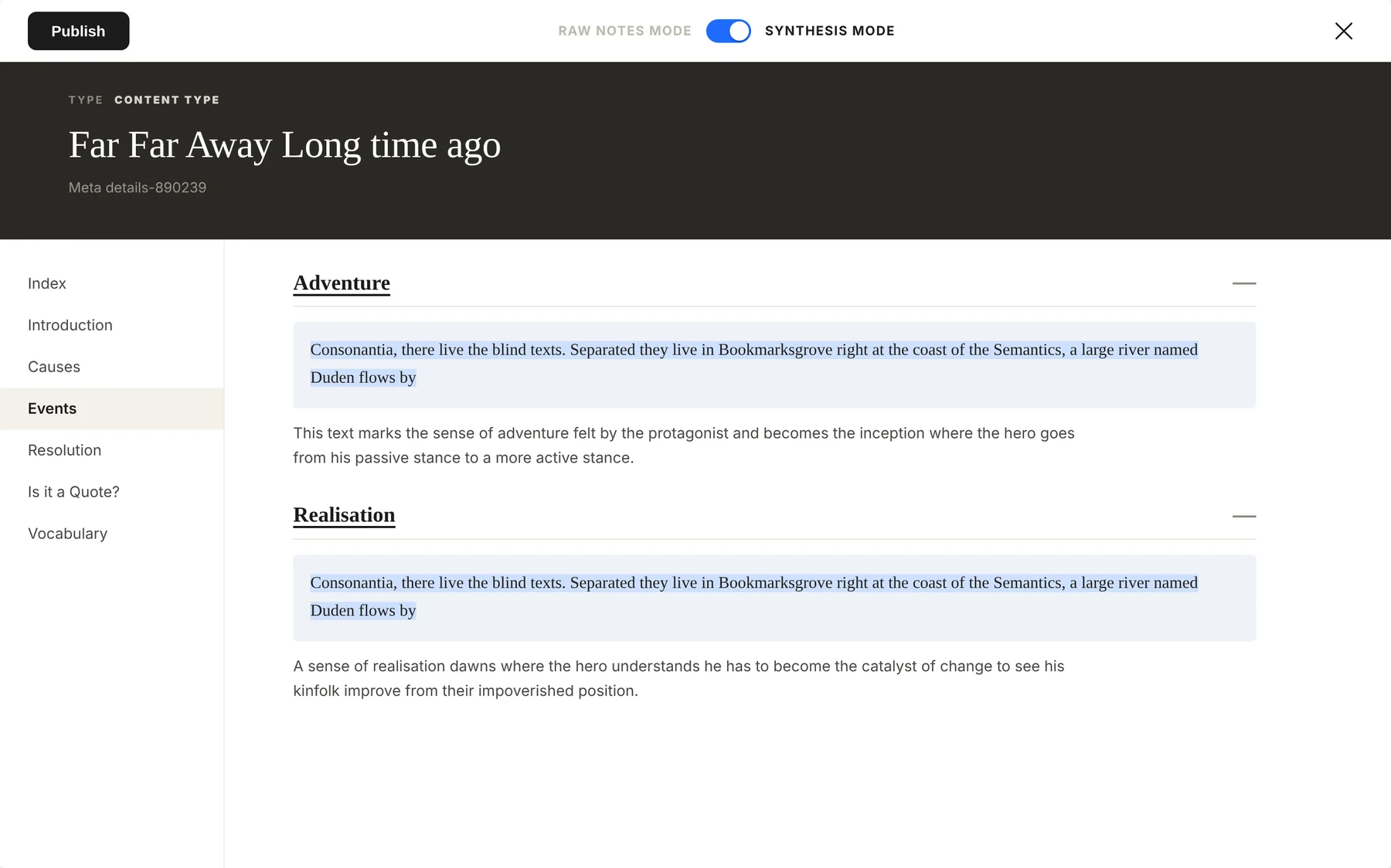
Flip the switch and every tagged excerpt gathers under its attribute, next to the researcher's own note on it, with the categories listed down the side. A page of raw notes becomes a structured document, ready to publish, without re-entering anything.
After internal testing, the tool launched in a pilot project in Nairobi.
Notes were annotated and processed faster, so other researchers could spot shared patterns and understand local customs sooner.
We didn't replace the researchers' way of taking notes. We digitised it and gave it structure, and that is why adoption held.
Many researchers still wrote by hand. Next I'd make on-device capture as easy as a pen, and add tag governance so user-created tags don't fragment across teams.
A scalable, accessible component library for a white-label product, built so a young start-up could move fast without its screens drifting apart.
I joined Ooloi Labs in 2019, straight out of architecture school, as an interface and experience design intern. The team had a prototype and user flows, but no shared system to guide design and development.
We built one from scratch between 2019 and 2022, carrying the founders' standards, values and philosophy into the new product framework. It became my longest-running project at the firm. After 2022 the work moved to updates and documentation, kept in Figma, Notion and Storybook.
A new team, many collaborators, unusual use cases and handoffs that lost detail. Even small slips made final screens look like a different product, which hurt the brand and the user experience. The risk grows as a design scales across platforms and clients, which for a white-label product is the whole point.
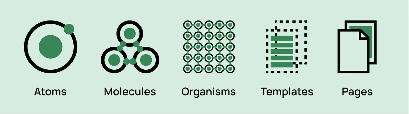
We used Brad Frost's Atomic Design to plan and sort the library, from atoms up to full pages. Buttons, text inputs and tags came first, then components like cards and button groups, then templates. Existing mock-ups and wireframes told us what to build next.
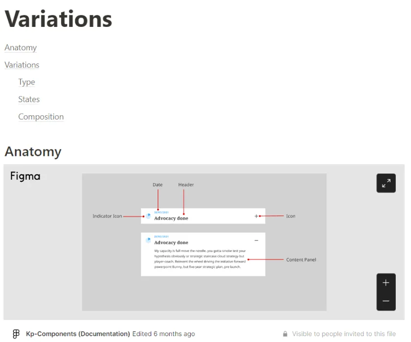
The library had to embody the brand: transparency, impact orientation, approachability, simplicity and groundedness. Every component was documented with its anatomy and variations so developers read from the same source as designers.
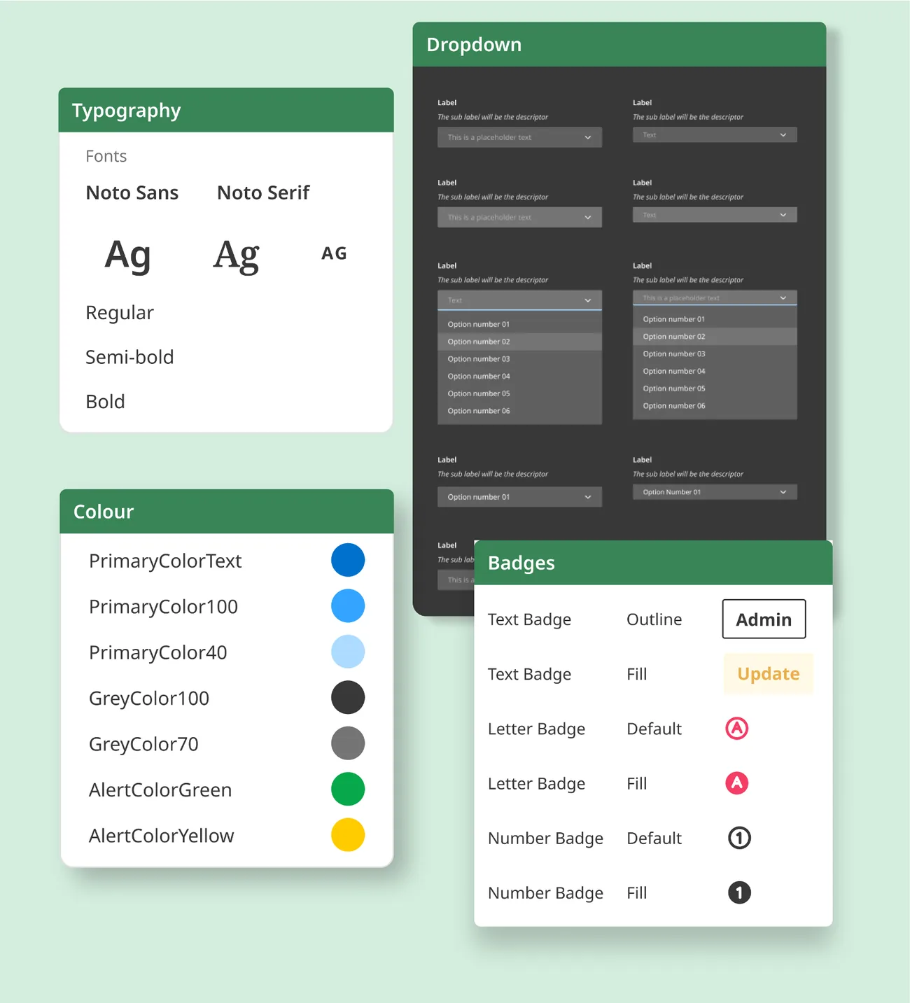
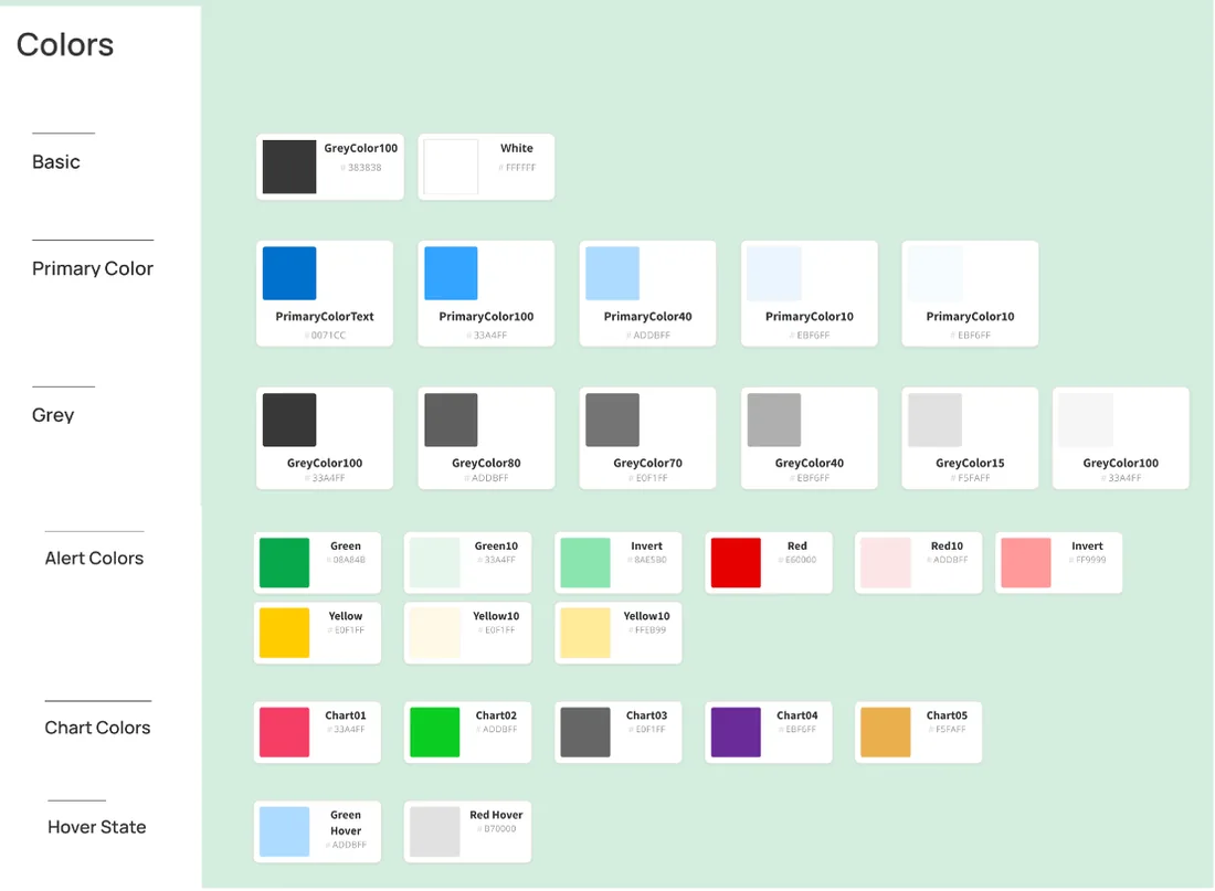
Simple, friendly and accessible: basic, primary, grey, alert, chart and hover colours, each named for its role.
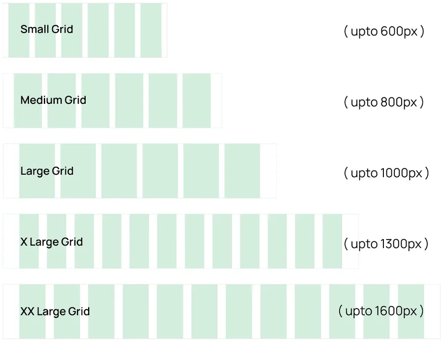
After several rounds with the development team we set grids and gutters for five widths, from small (up to 600px) to XX-large (up to 1600px).
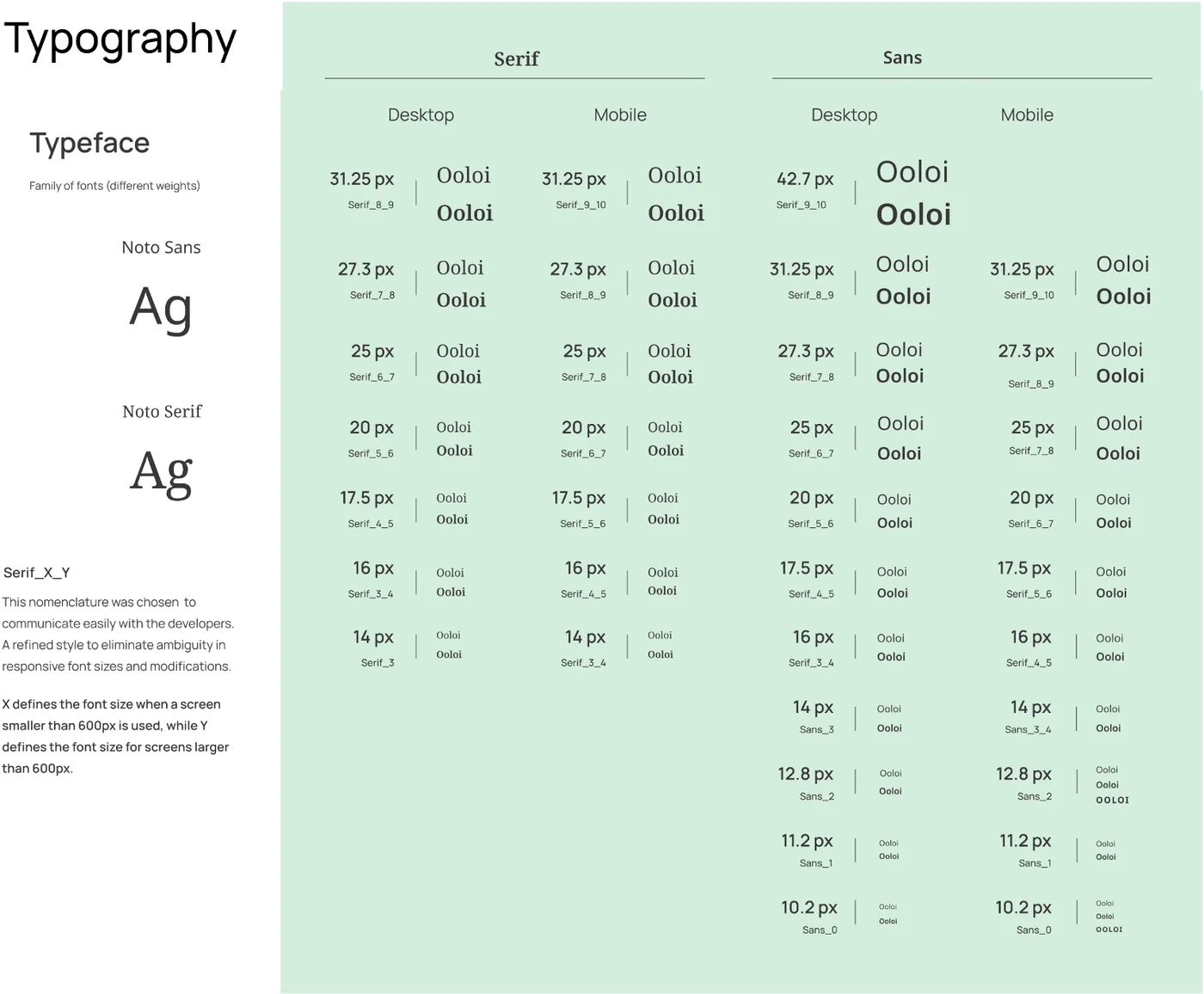
Noto Sans and Noto Serif on a responsive scale. Each style is named Serif_X_Y or Sans_X_Y: X is the size on screens under 600px, Y the size above, so developers never had to guess.
We adopted the Phosphor icon library, and worked with an in-house illustrator on empty-state, error and task-complete illustrations and a set of abstract placeholder patterns.
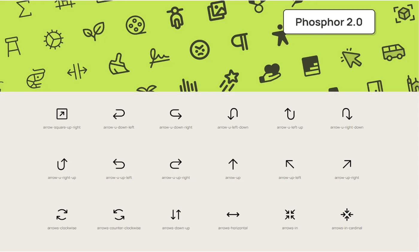
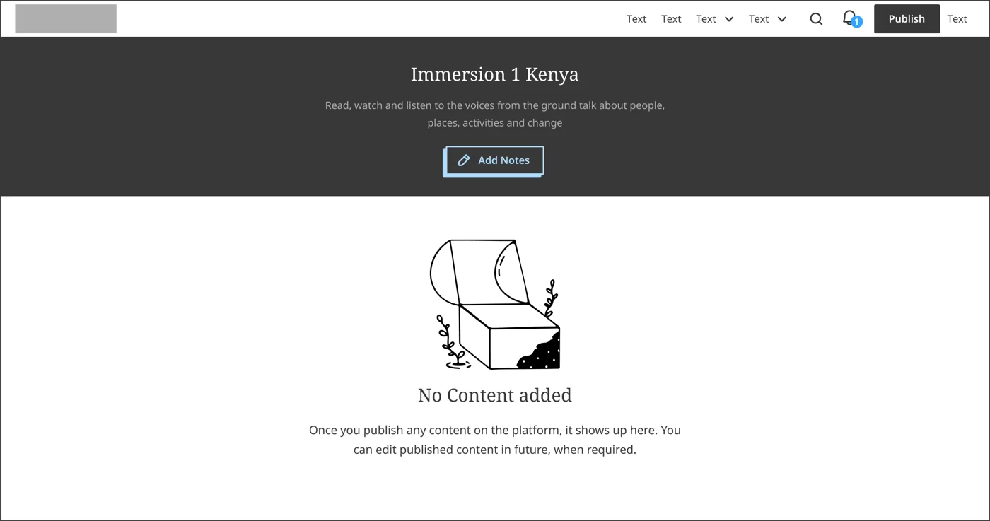
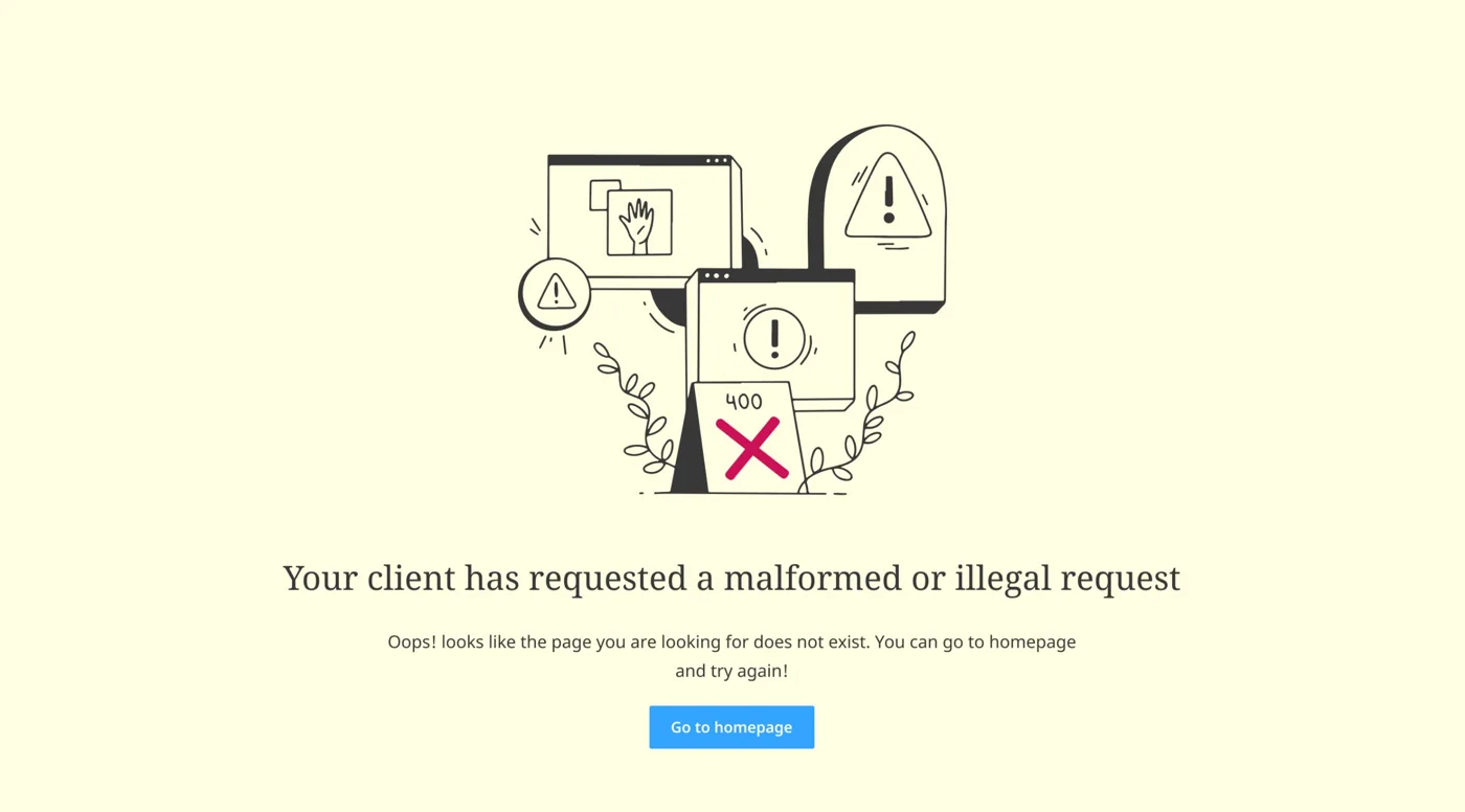
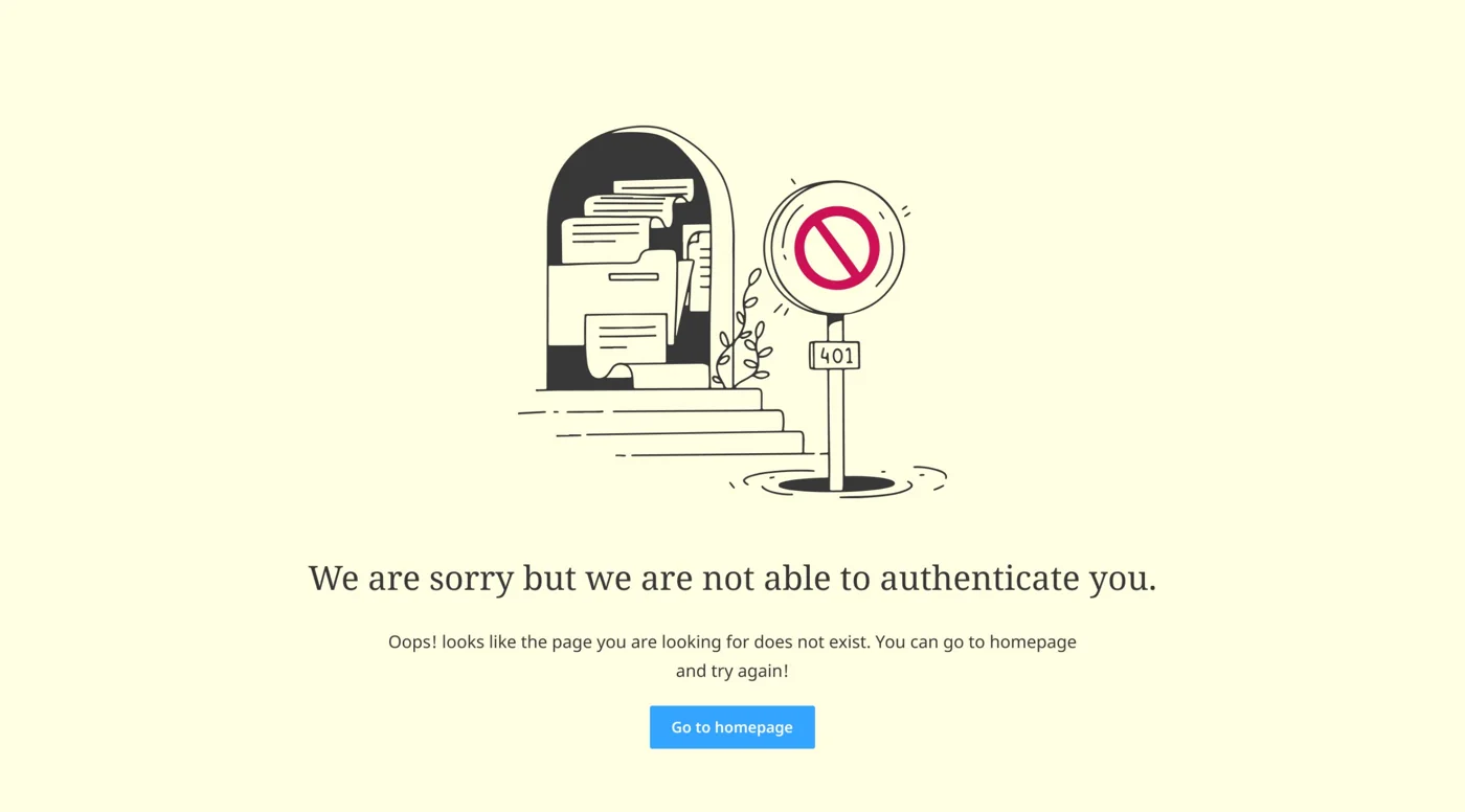
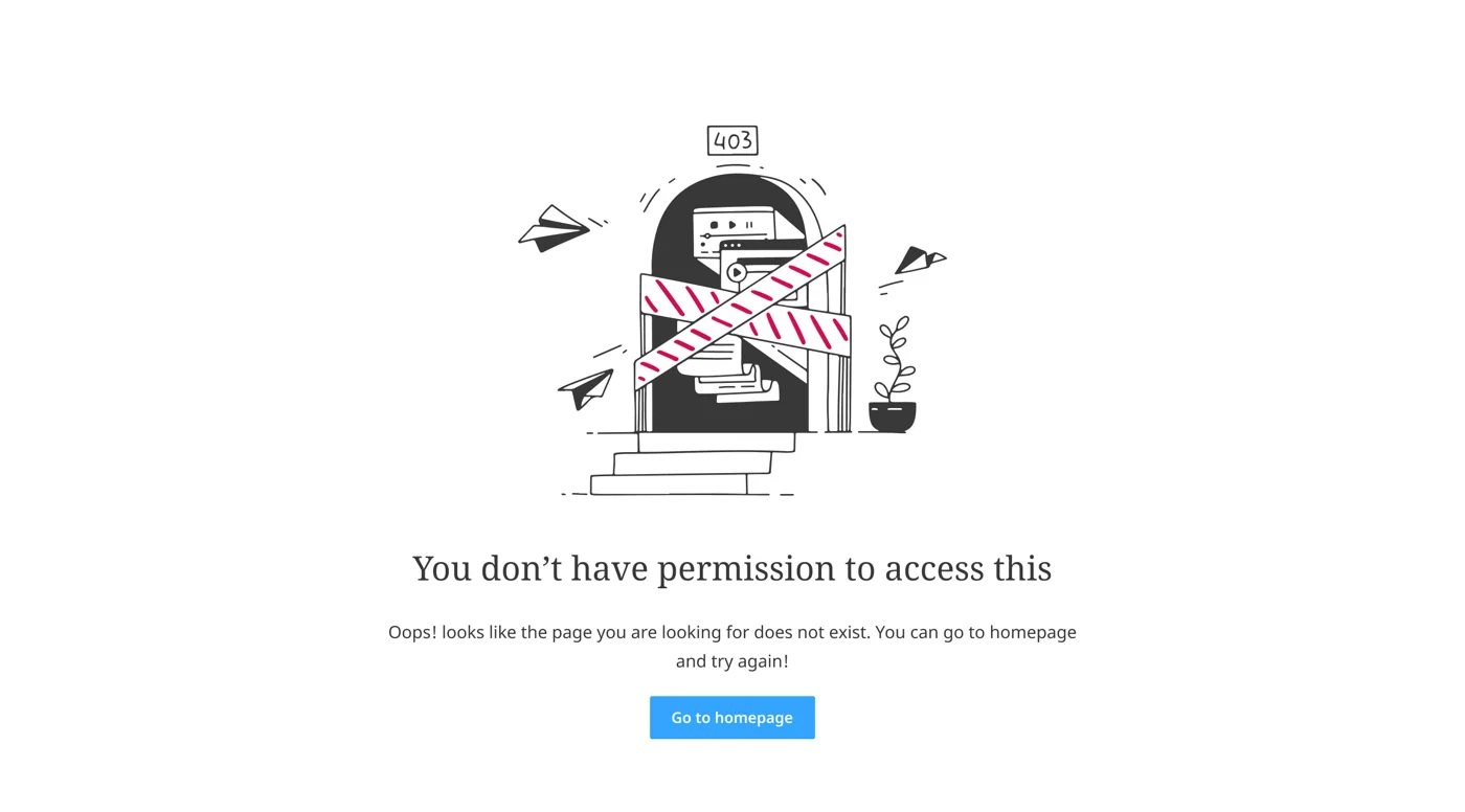
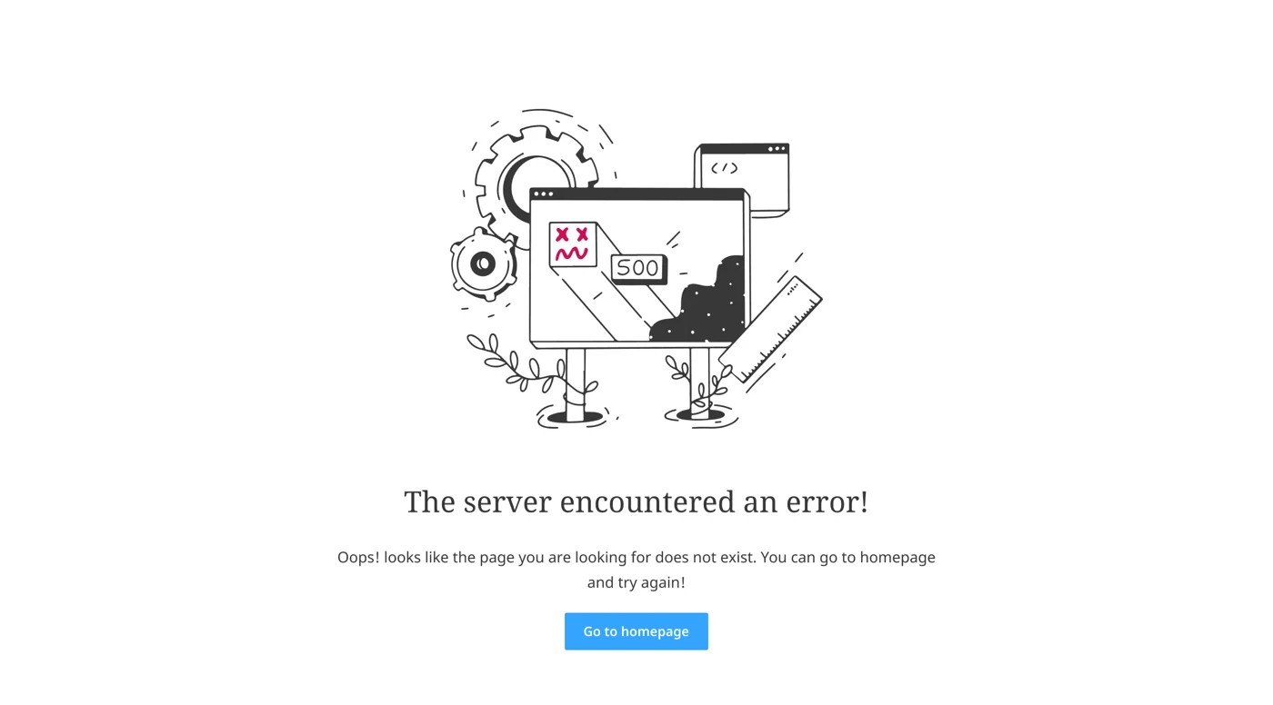
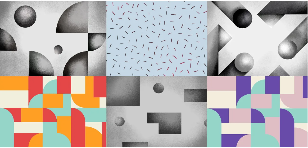
We started with what the product needed then and added components as new use cases arrived, designing each one against the existing set. Every component ships in light and dark versions.
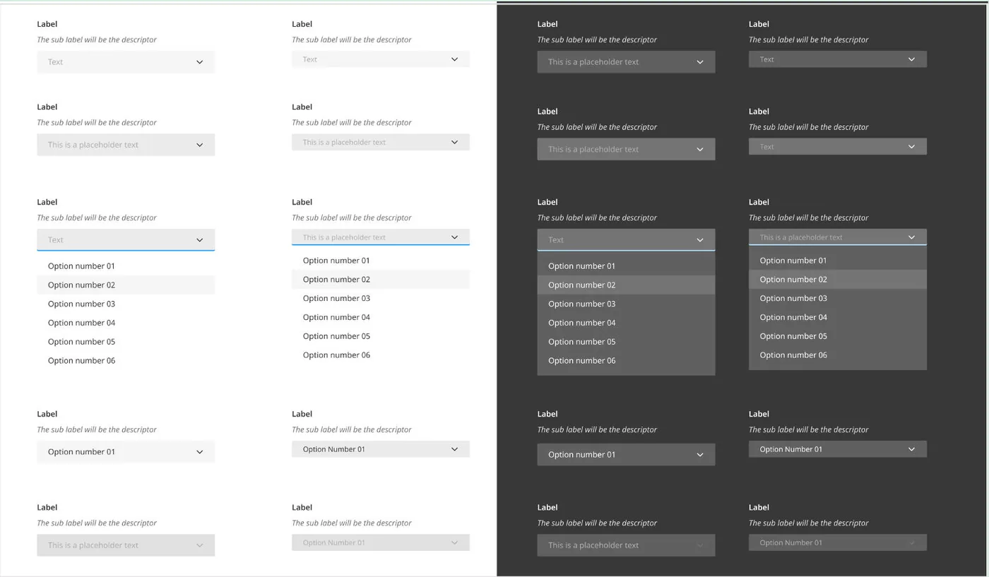
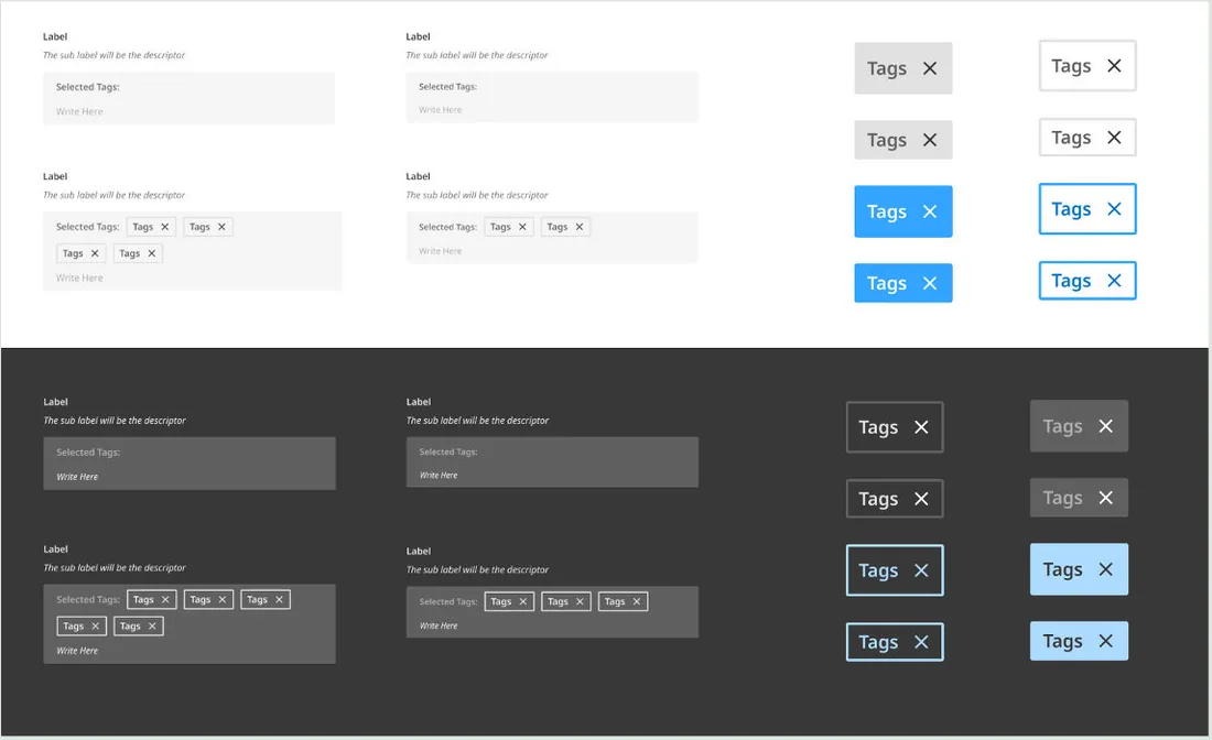
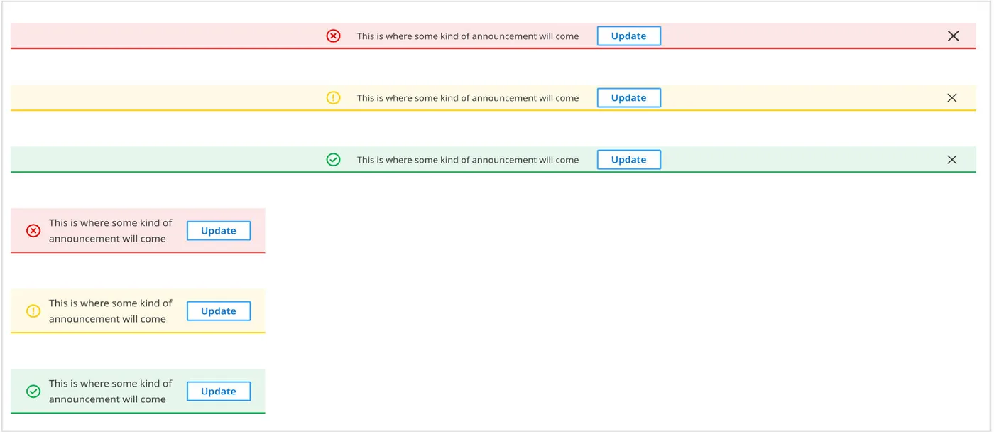
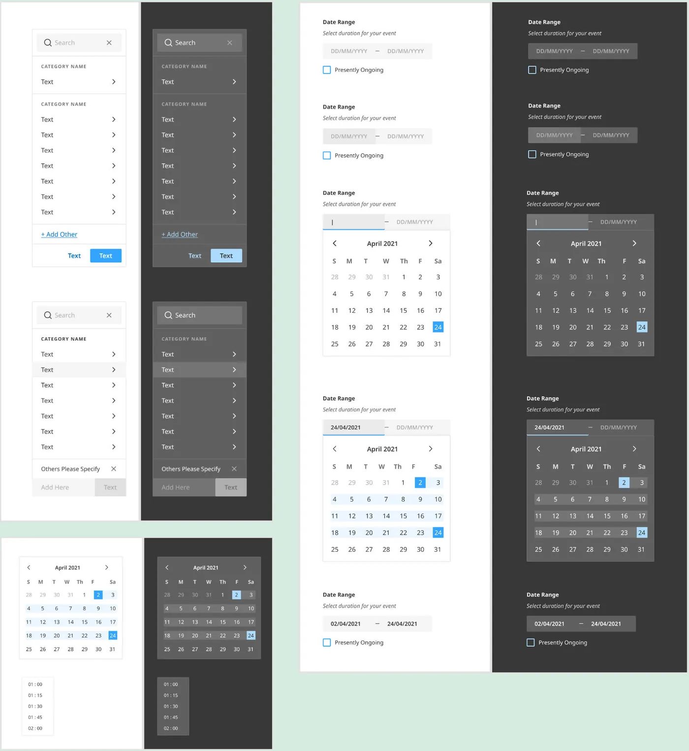
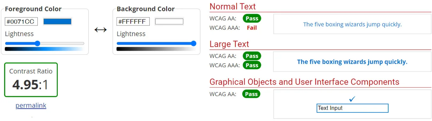
We tested every text and component colour against its backgrounds with the WebAIM contrast checker, and let the ratios decide which combinations people with low vision could read best.
Designers and developers built from the same components, every product line shared one brand, and the design team stopped recreating the same elements.
"It didn't produce a screen anyone would praise. It produced the conditions under which every screen could stay coherent."
Designing for other designers and developers, and documenting decisions so they survive handoffs, mattered as much as any component I drew.
The real test is whether it still holds fifty components later. Next time I'd invest even more in naming and structure, so growth doesn't turn into entropy.

A mobile platform that helps young adults look after their mental well-being through community and structure.
Chalkpiece, a non-profit, set this challenge in 2020. Young adults were facing anxiety, stress and depression, with pressure to succeed academically, socially and professionally. Affordable care was hard to reach, and the stigma around asking for help kept many from seeking it at all.
We set out to build an app where people could seek guidance, share experiences and reach professionals, with structure to help them plan and prioritise through a hard year.
Students and young professionals
Therapists, counsellors and mental health coaches
Community, goals and gentle structure
We followed the Double Diamond. Secondary research covered articles and surveys on young adults' mental health during COVID-19. We surveyed 58 people about their stressors, habits, awareness and goals, then interviewed 5 of them in depth.
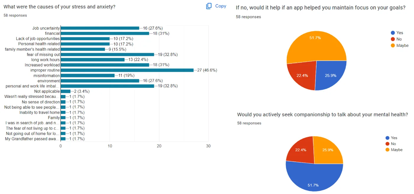
Four needs came out of it:
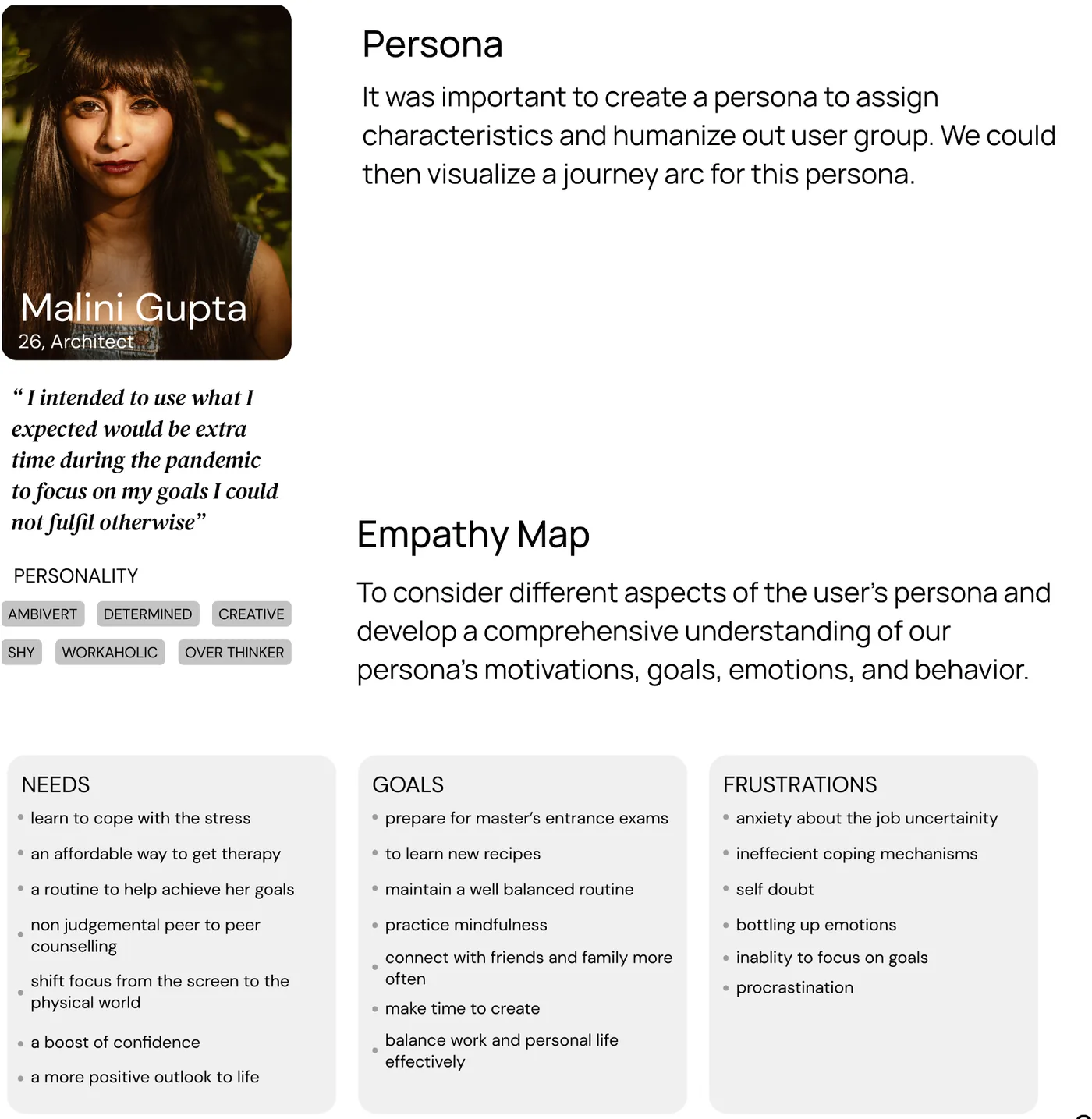
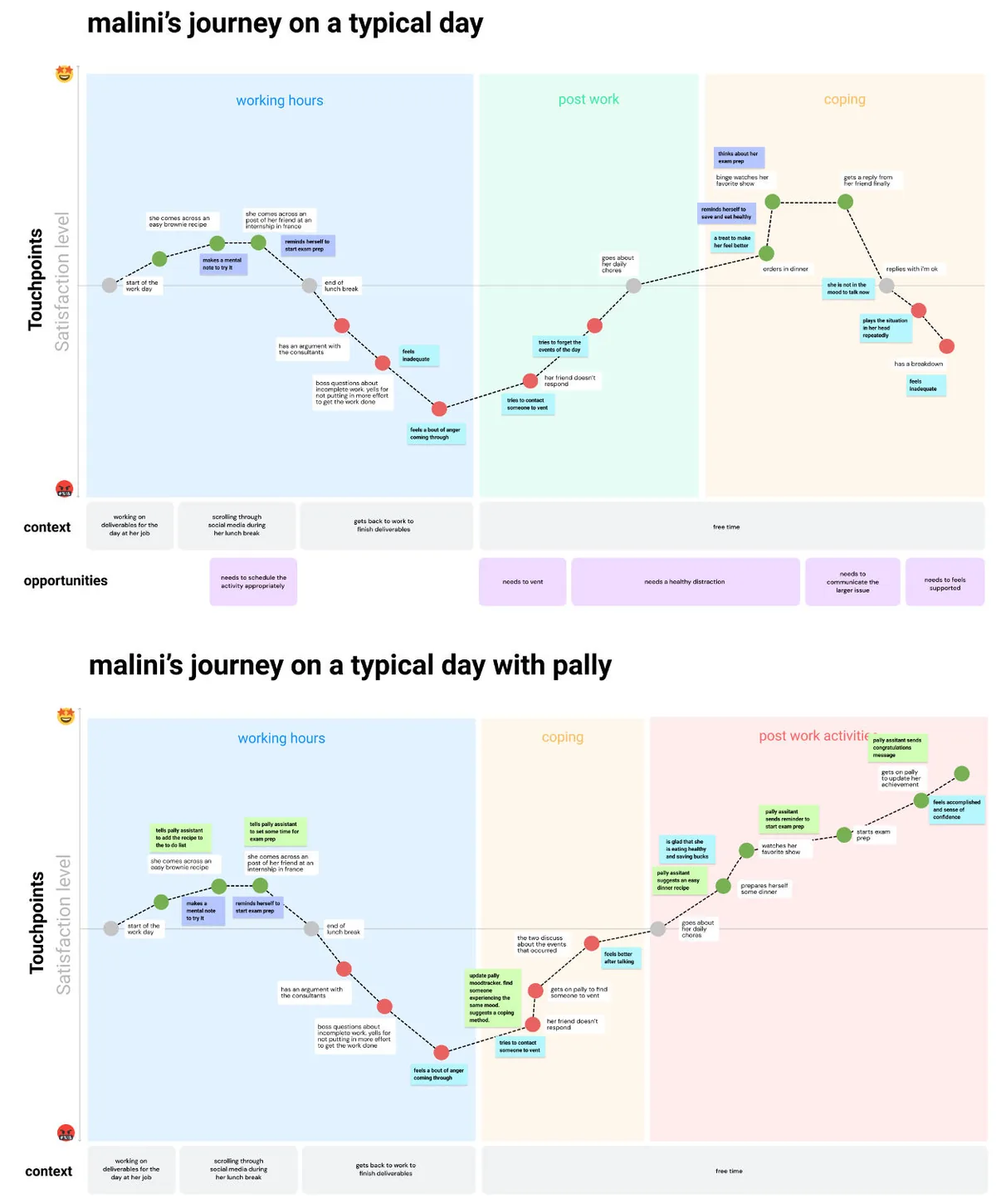
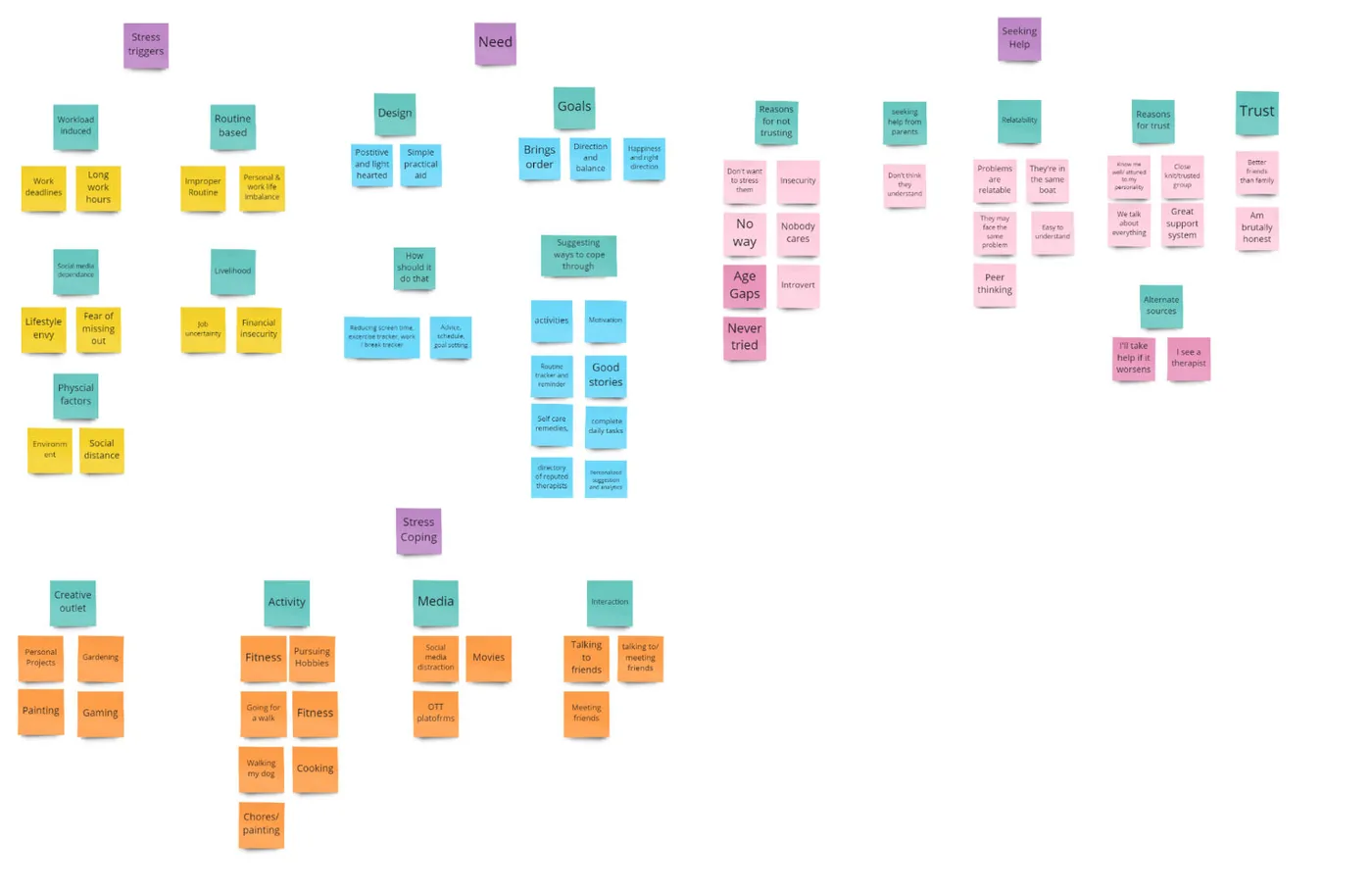
A persona and empathy map kept the team focused on one person's needs, goals and frustrations. We mapped Malini's typical day before and with Pally, then grouped everything we'd heard into four themes with an affinity map.
Suggest ways to reach a goal, suggest content based on mood, watch for crisis triggers, send gentle reminders and encourage people to engage with each other.
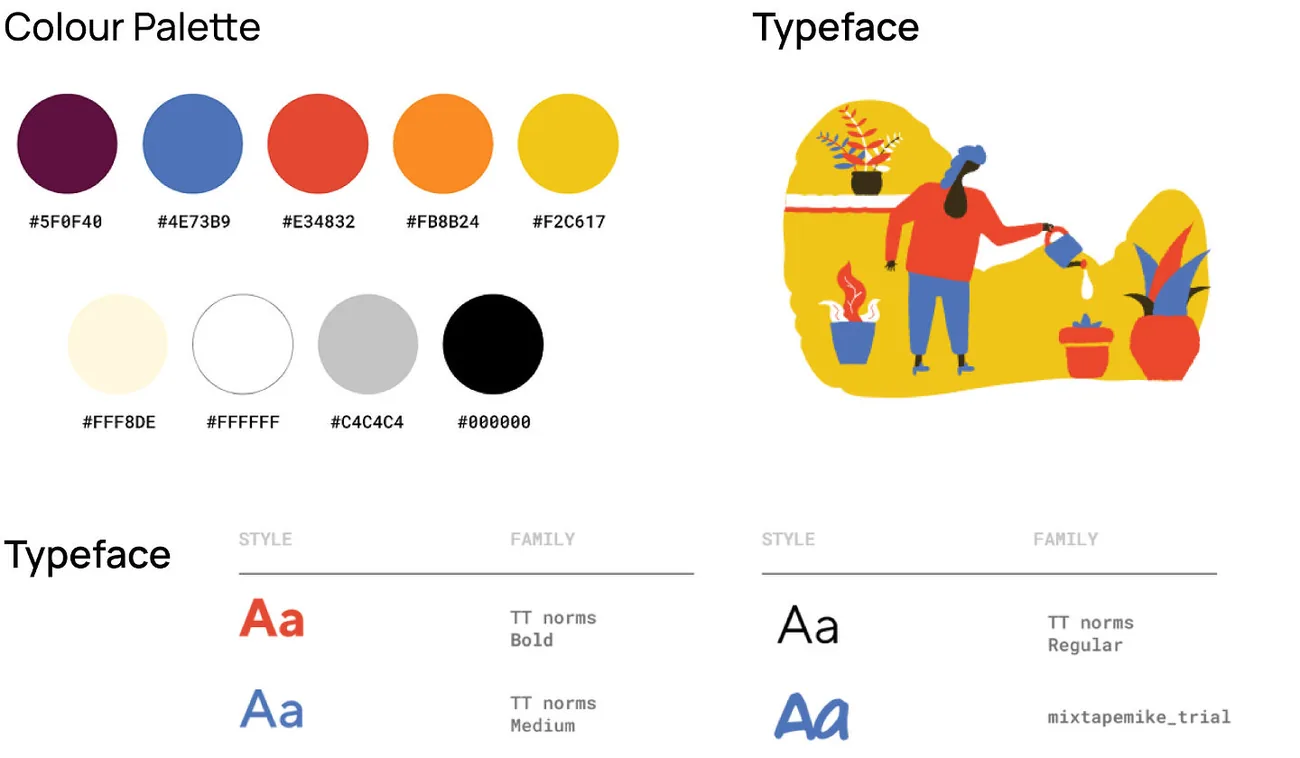
We mapped the information architecture across onboarding and two levels of navigation, sketched low-fidelity wireframes, then gave Pally a warm palette and friendly type so it felt light rather than clinical.
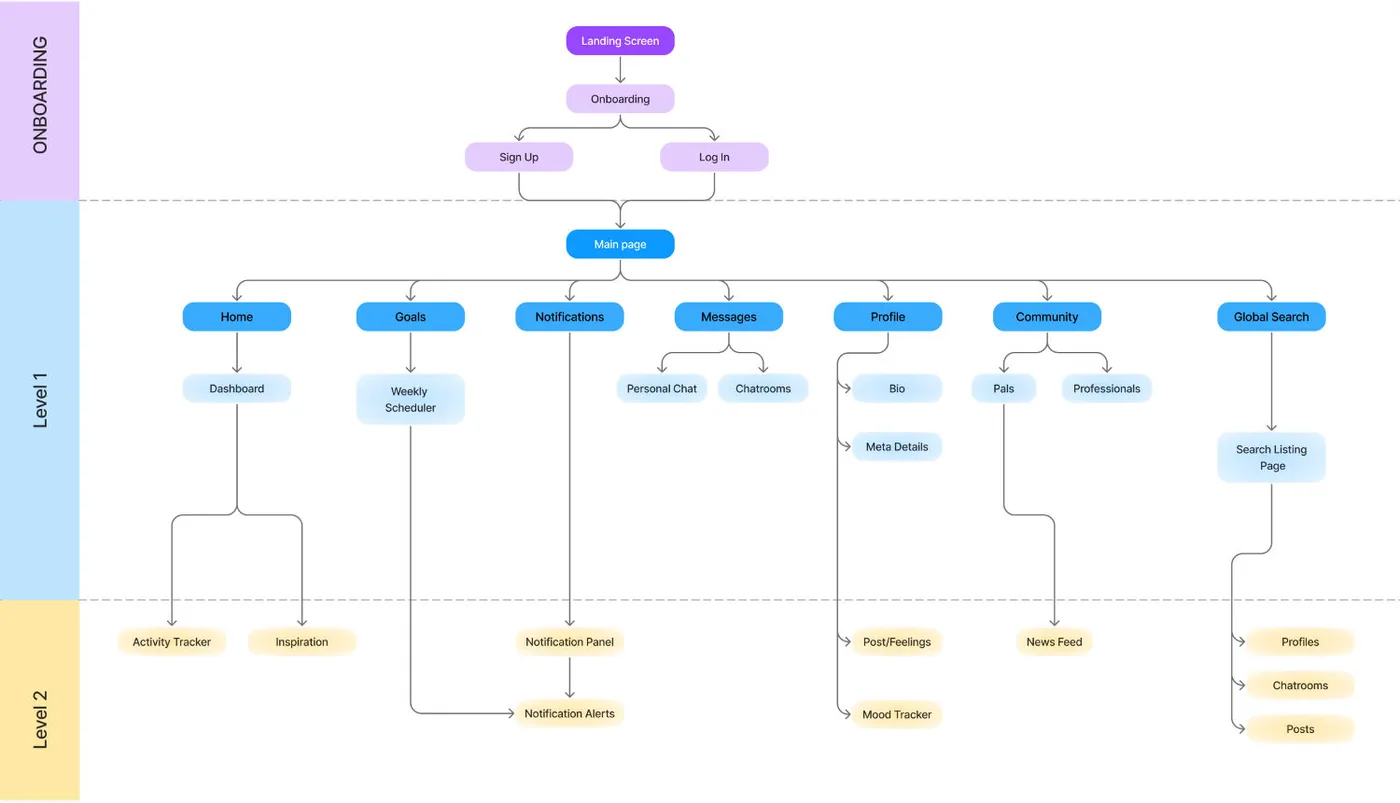
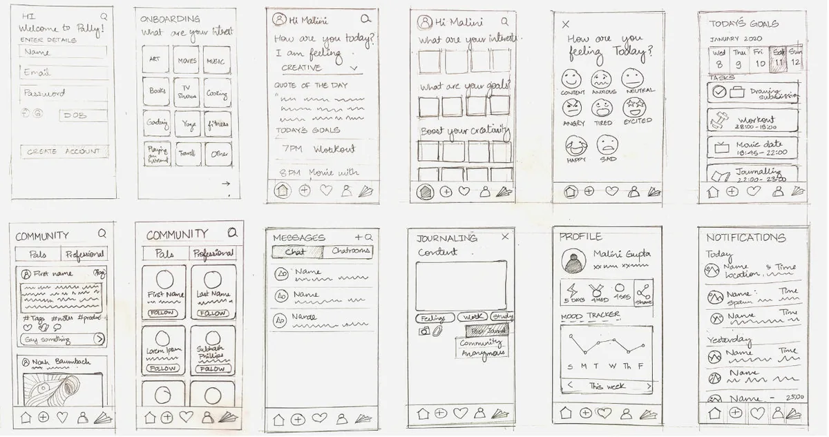
Onboarding records goals and interests so the home feed, quotes, chatrooms and suggested professionals are personal from day one. The home screen shows today's mood, goals and inspiration at a glance.
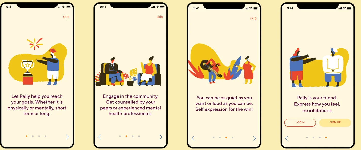
Three flows in motion: picking goals during onboarding, sharing a post with the community, and switching between one-to-one chats and themed chatrooms for finance, work-life balance, fitness, books and more.
We asked four people from our audience to journal their feelings, message a chatroom, add a goal and explore the community. They moved through the app easily and liked the interface. They also told us what to fix:
Reimagining civic design to make room for future generations, without slowing down the work happening today.
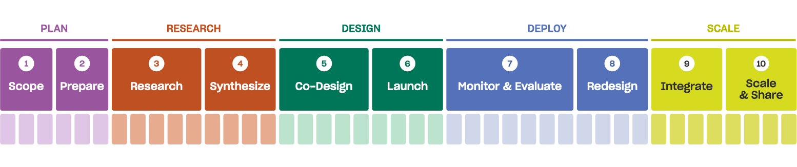
Public Policy Lab runs a structured, ten-step release model that moves projects from scope to scale. It builds momentum, clarity and accountability, but it leaves little room to ask: what happens after we're gone?
"It never feels like there's enough time."
A project lead, echoed across 19 interviews and workshops.
One person thought 18 months ahead; another thought in generations. Teams were focused on immediate needs, existing foresight tools felt like extra work, and long-term thinking happened too late or not at all.
A rigid futures tool would fail. We designed small moments of future-thinking that fit inside the process PPL already had.
We studied the Danish Design Centre, e-Estonia and Helsinki Design Lab, but the sharpest insight came from PPL's own team. Across 19 interviews, shadowing and retrospectives, people sketched their workday, mapped how decisions really happened and revisited past projects through a futures lens.
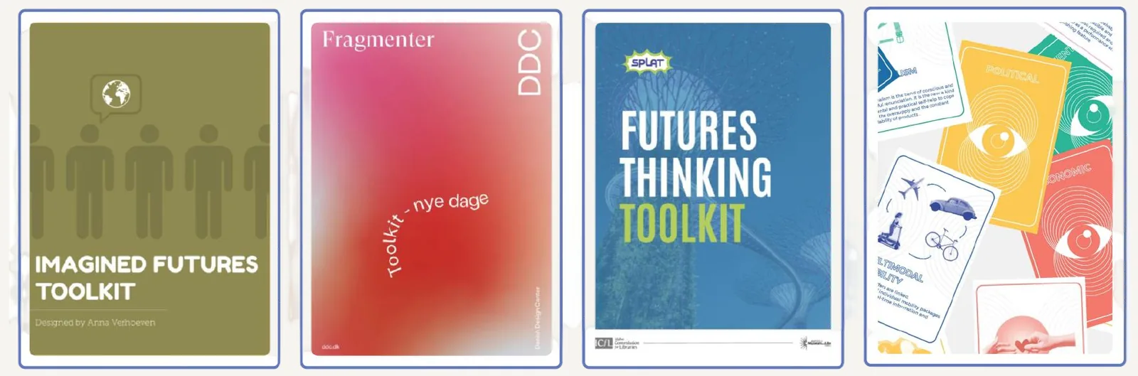
We built scenario workshops around a real problem: ER overcrowding in post-pandemic Baltimore. Five teams planned across three horizons, then adapted as we broke their plans: funding vanished, a new administration arrived, another pandemic wave hit.
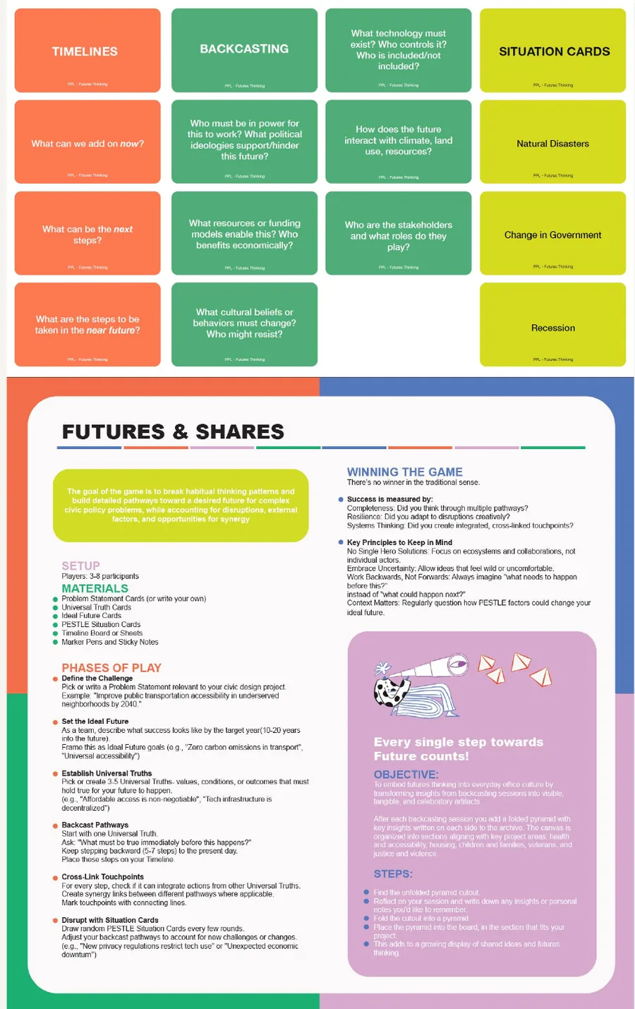
If futures thinking lives in a report, it disappears. So the canvas is physical, modular and foldable, and stays up in PPL's workspace. Each project adds a panel until the wall becomes an archive of the futures imagined across the lab's work.
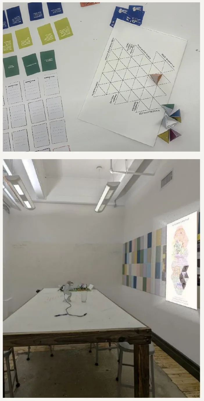
A card game that makes backcasting easy to facilitate. Instead of asking a team what they should think about, the cards give them something specific to react to, challenge and build on.
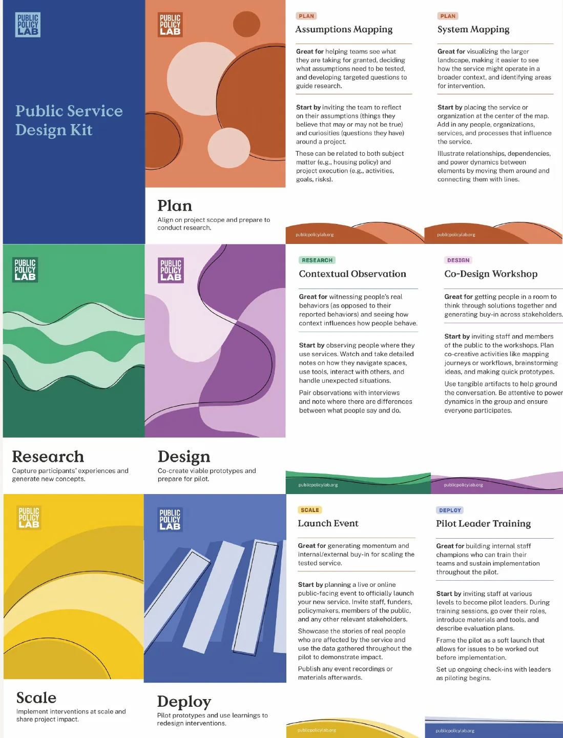
A lightweight futures toolkit mapped onto the release model, with prompts at natural checkpoints.
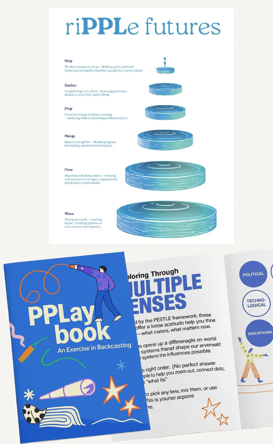
A printed backcasting exercise that uses several lenses to bring staff and partners into longer-term thinking.
Teach people to think in longer timelines, and build that thinking into the work itself.
"Today's solutions are tomorrow's problems."
There are already plenty of futures frameworks. The harder question was whether an overloaded team would actually use one, so every activity had to earn its twenty minutes.
I designed and facilitated the participant workshops, researched case studies on participatory design, supported the futures canvas and wrote content for the card game.
A futures practice is only useful when people can pick it up, understand it and use it again after the designers leave.
Organisational design means learning where power sits and where decisions really flow from.

Designing microfinance that grows without exploiting the people it serves.
ESKALA grew out of Global Brigades and now runs as a for-profit impact investor. Instead of lending to farmers directly, it makes micro-equity investments: small ownership stakes in community banking co-ops, called cajas, in Honduras, Nicaragua and Panama.
Each caja decides for itself how to lend that money, mostly to farmers and artisans. Because ESKALA is a shareholder and not a lender, the capital comes without the harsh terms of a loan, and more of the return stays in the community.
Investors put money into ESKALA because they want a social return as well as a financial one. That patience is what lets ESKALA invest in small, rural institutions that banks usually ignore.
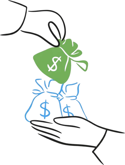
ESKALA buys a small ownership stake in a community caja, from about $500 to tens of thousands of dollars. There are no repayment schedules or collateral; ESKALA earns only if the caja does well.
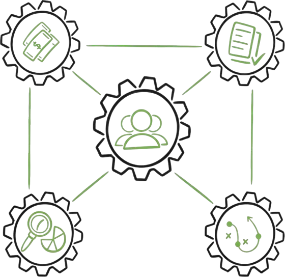
The caja is the community's own savings-and-lending group. Members pool their savings with ESKALA's capital and decide together who borrows, for what and on what terms.

Members borrow $50 to $1,000 for seeds, tools, livestock or stock for their craft. As they repay with interest, the caja's pool grows and can lend to more people.
Repayments and interest flow back to the caja, so the same money is lent again. Profits are shared with members, and with ESKALA as a part-owner.
Help ESKALA scale its capital across Honduras, Nicaragua and Panama in a way that builds farmers' knowledge, trust and collective market power, instead of their dependence on ESKALA?
For ESKALA’s capital to work in these communities, three things have to be in place:

Financial products are hard to navigate without practical knowledge of credit, budgeting, savings and risk.

Formal systems feel distant and opaque; informal savings are accessible but rarely open a path to growth.

Even productive farmers lose value to price swings, distance from markets and unequal bargaining.
68% of Latin Americans have never received personal finance training (World Economic Forum, 2023).
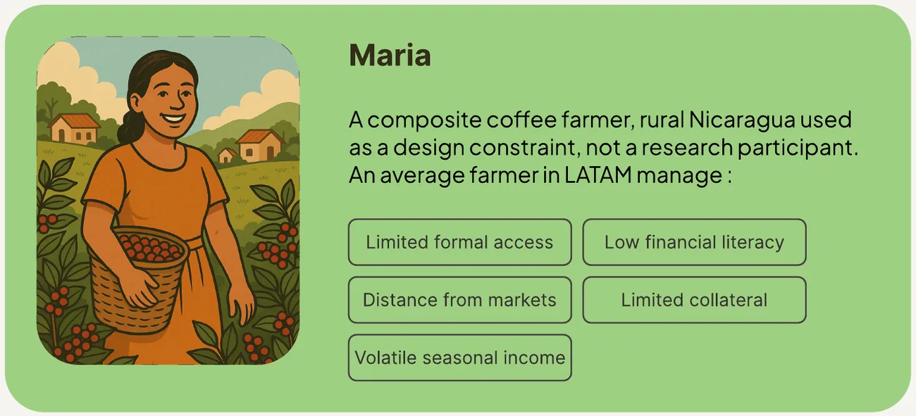
Maria is a composite coffee farmer in rural Nicaragua. She was a design constraint, not a research participant: if an idea couldn't survive her conditions, we challenged it. She isn't a substitute for broader evidence.
Our proposal builds capability first, then collective capacity, then market leverage, while lending between the institution and individuals carries on.
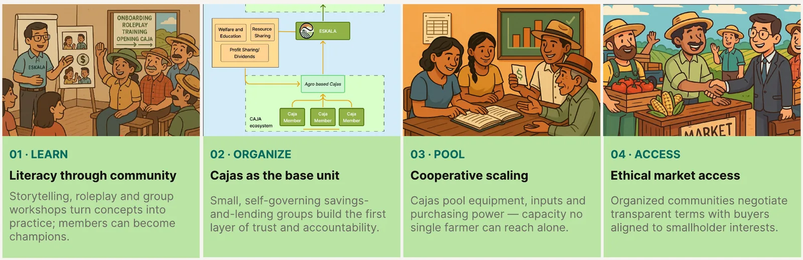
Communities save, lend, self-govern and pool resources. Buyers offer fairer terms and transparent payment. ESKALA coaches, invests, negotiates, builds the network and keeps everyone accountable.
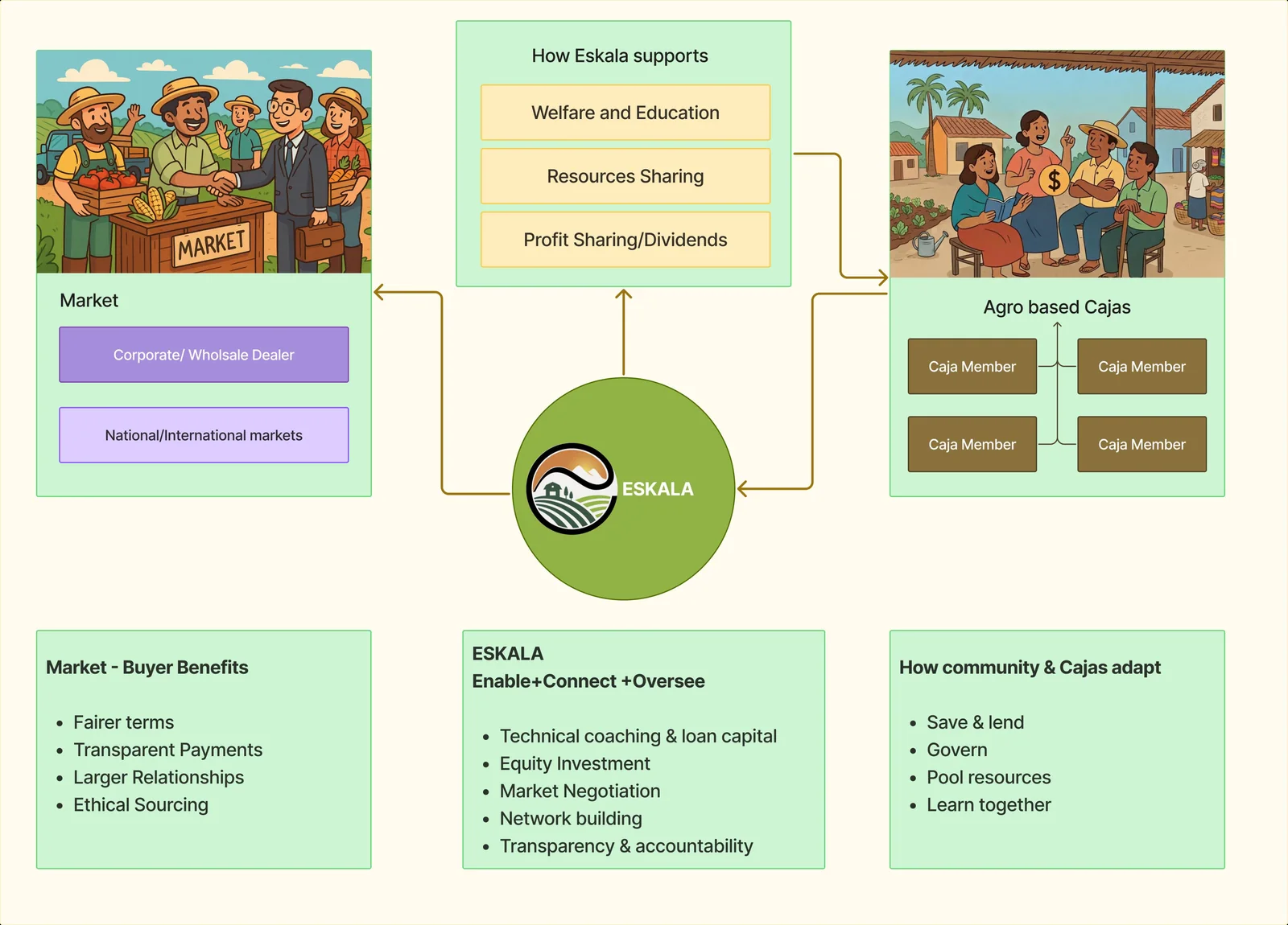
ESKALA's job is to build and scale collective agency, not dependence on ESKALA.
For the model to scale ethically, governance has to scale with the capital. Zones govern regional blocks, centres coordinate the cajas in an area, and each caja governs its own savings, lending and duties.
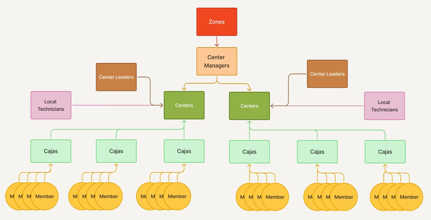
Centralise accountability where it creates value. Decentralise decisions where local knowledge matters.
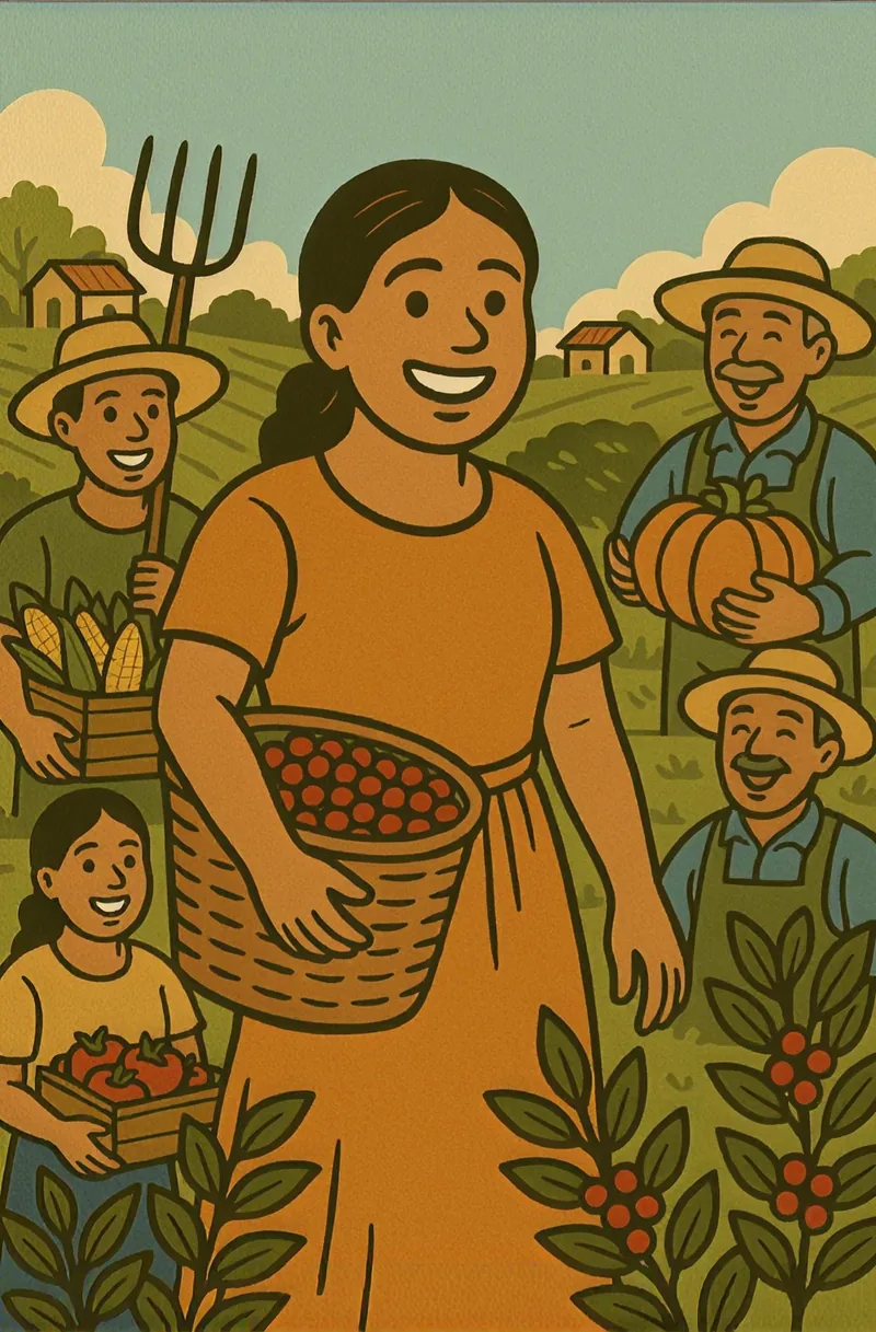
Access to knowledge, shared resources and collective market relationships.
More value redistributed, while building social capital and local ownership.
Farmers become a collective financial actor rather than individual borrowers.
The real challenge will be scaling trust, capability and collective power while building independence.
Earn from value created, not debt: buyer fees and a share of negotiated price uplift, plus capped rates. ESKALA wins only when farmers do.
Offline-first and group-based: the caja ledger stays the source of truth and digital just mirrors it. No farmer needs a phone to take part.
Federate, don't centralise. Standardise the interfaces, not the decisions, so more cajas mean more collective power, not more admin.
Reconnecting a fragmented eyewear journey to lift order value and loyalty for a fast-growing Gulf retailer.
Parsons Design Sprints pairs studio teams with outside partners on real strategic problems. Our partner was Eyewa, a Middle East eyewear retailer growing fast across the Gulf. We were briefed directly by their Chief Strategy Officer and Strategy Lead.
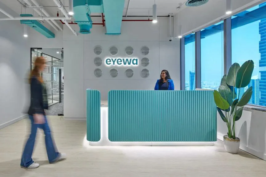
Connect the journey across online and offline to raise average order value and NPS, and open a new revenue stream?
We scoped market positioning, product experience, personas, pricing, competitive forces and the supply chain, then moved quickly from discovery to design using the Osborn–Parnes creative problem-solving process.
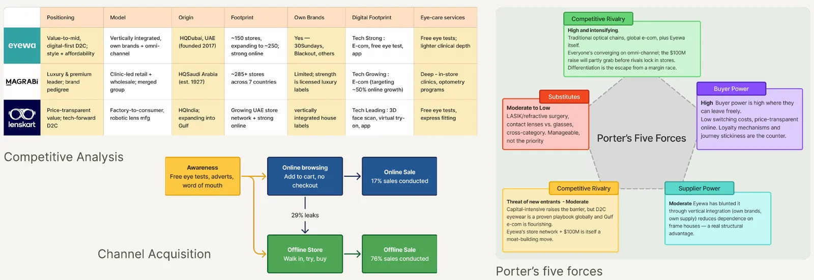
29% of online carts convert offline, but the handoff isn't tracked, so the sale can't be credited to the journey.
Mid-tier products and add-ons are missing and there's no loyalty loop, so the path from base to premium stays invisible.
Two similarly priced house brands can't cover both value and premium. Branding should sell self-expression.
Vertically integrated and well funded, Eyewa's mandate is to grab market share, not optimise margin.
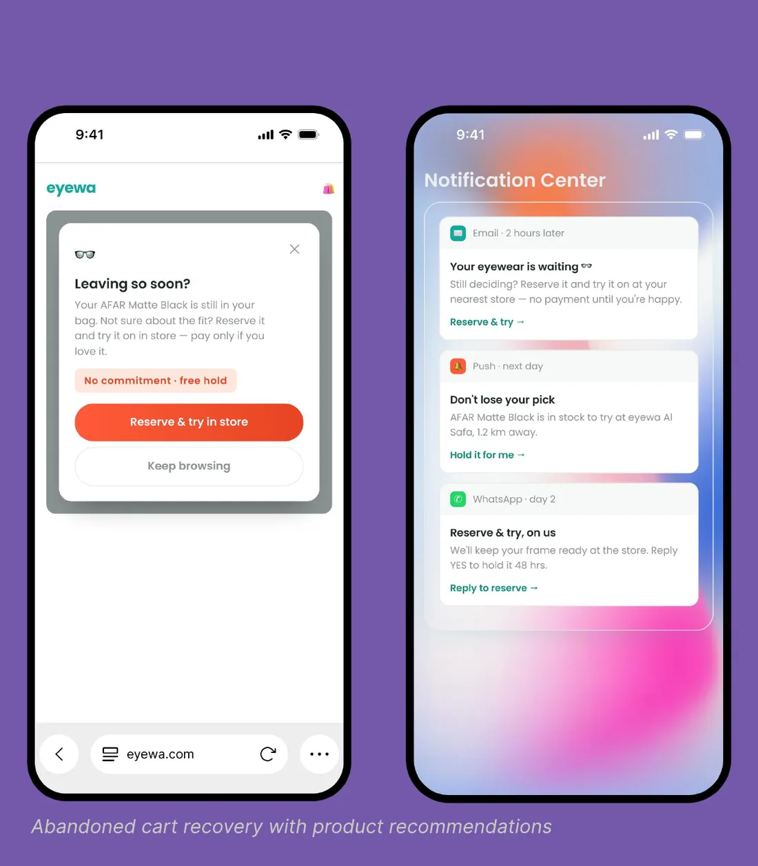
A continuity layer so a browsing session doesn't die at the cart. It follows the customer into the store, and Eyewa finally sees it.
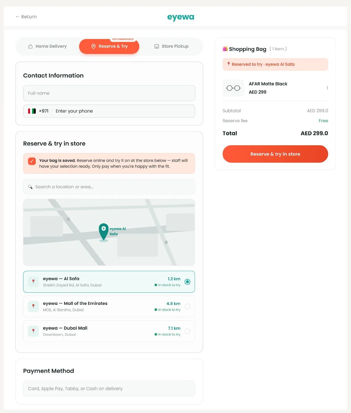
A guided journey that builds confidence and basket size at the moment of decision, then remembers the customer and rewards them for coming back.
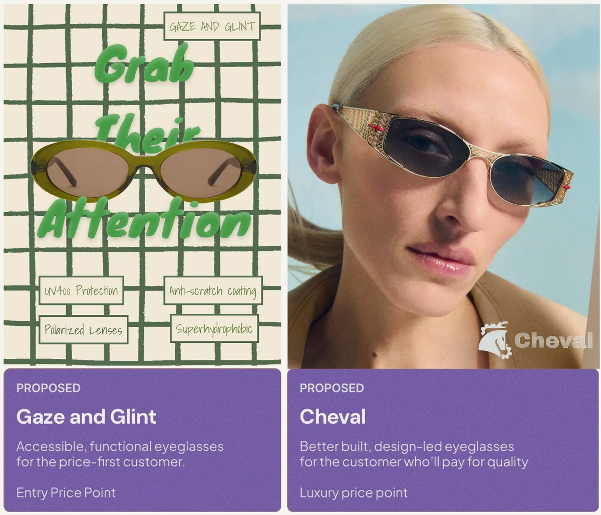
Eyewa's two house brands, 30 Sundays (trendy, versatile) and Blackout (dark, bold, edgy), are priced alike. We proposed extending the range to how customers express themselves, covering both ends of the market.
Proposed. Accessible, functional eyeglasses for the price-first customer, at an entry price point.
Proposed. Better-built, design-led eyeglasses for the customer who'll pay for quality, at a luxury price point.
Branding sells self-expression, which lifts order value without competing on price alone.
Class projects and speculative concepts that sit outside my main case studies: research I did to understand a system, and ideas I built to question one.
Mapping the access economy to understand what we gain, and what we lose, when access replaces ownership.
What quietly went away without anyone noticing? Ownership.
We used to pay money and then the thing actually belonged to us. Now everything is rented, leased or sold "as a service": music, software, even printer ink. We spend and spend, and in the end we hold nothing in our hands.
This was a research project for the course New Economies and Societies at Parsons. I mapped the access economy to understand what we gain and lose when access replaces ownership: who the actors are, how platform, gig, access, sharing and peer economies divide up labour and markets, and which companies sit in each. I also looked at the trade-off of membership and subscription models, which widen access but bring customer fatigue, rising prices and underused value, and ended with practical questions about how to engage with this economy without becoming more vulnerable to it.

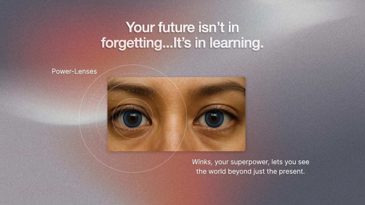
What if you could revisit any moment from your past, and learn from it?
Winner, Parsons School Prize at Figma Build 2025, Figma’s first national design competition, chosen from 60+ teams and 170+ students.
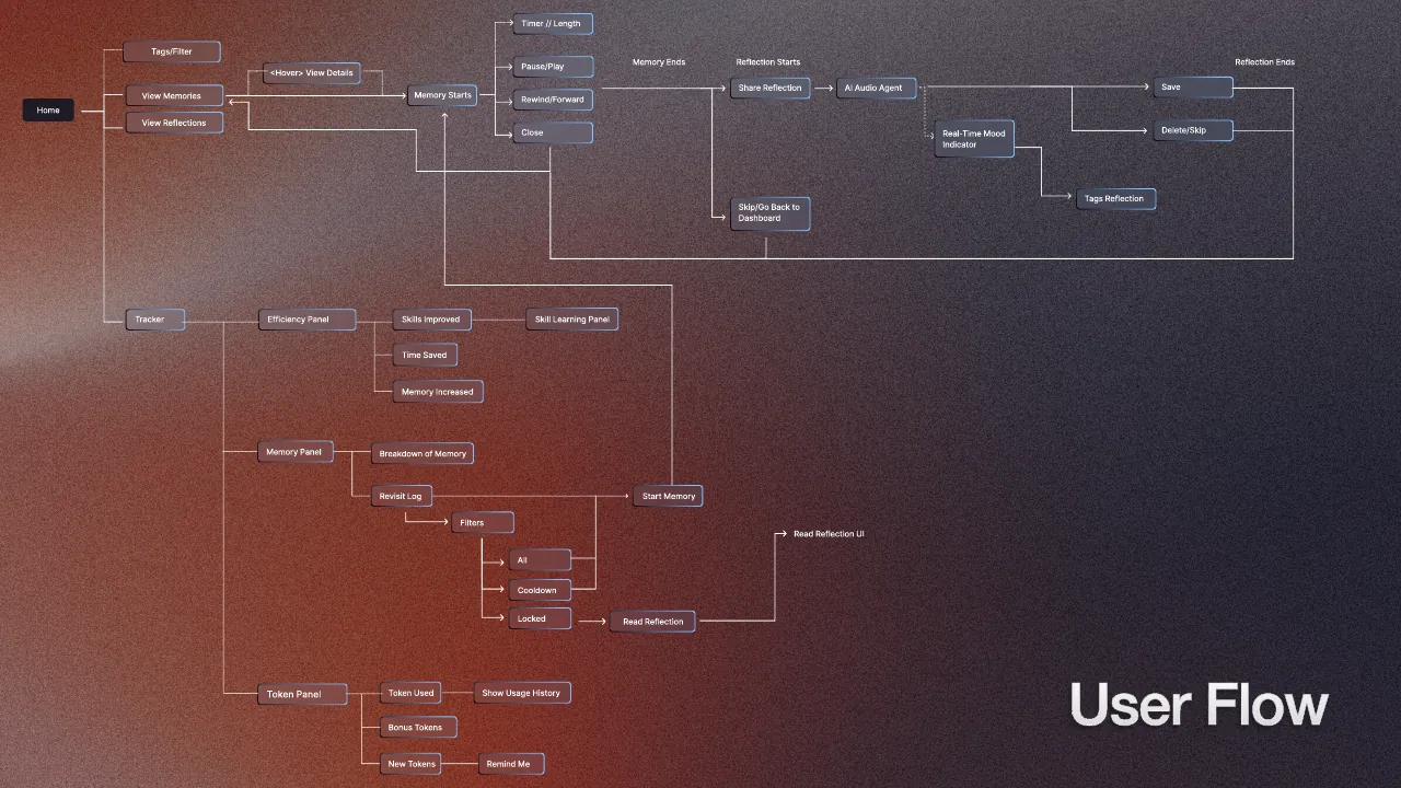
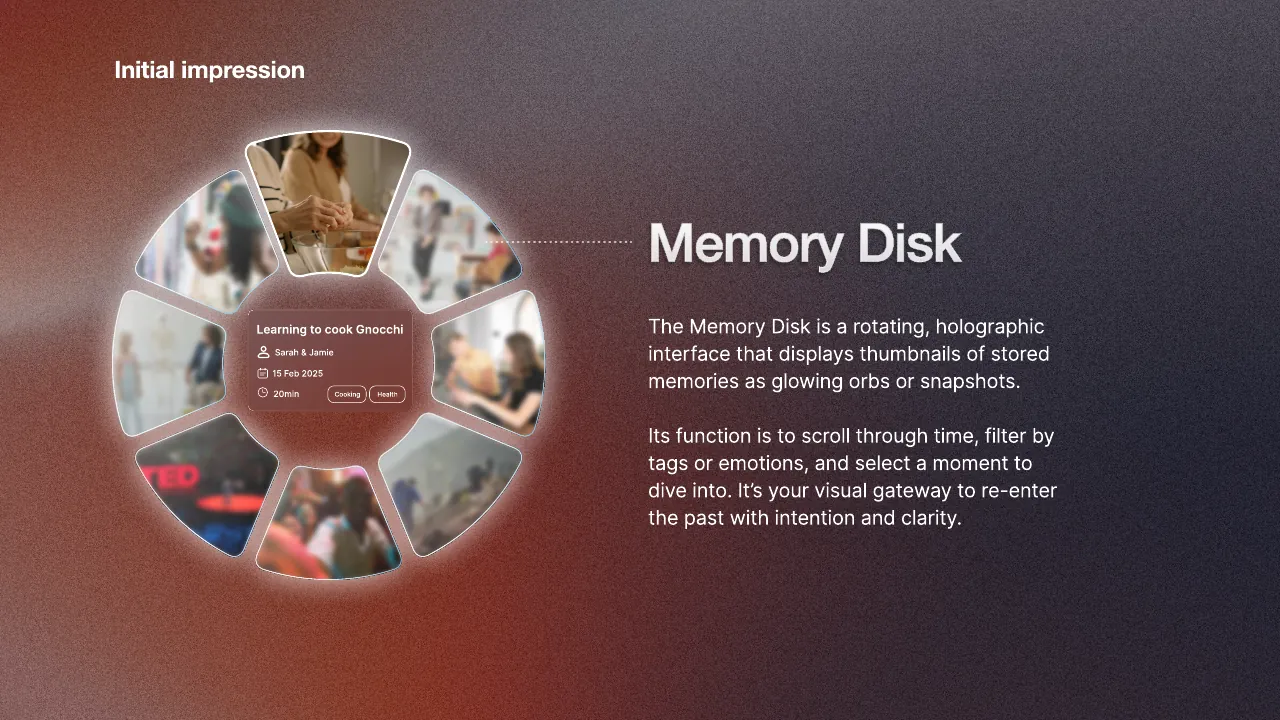
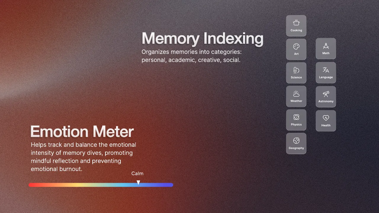
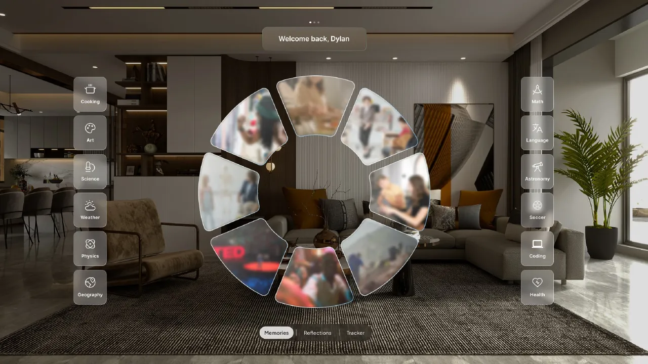
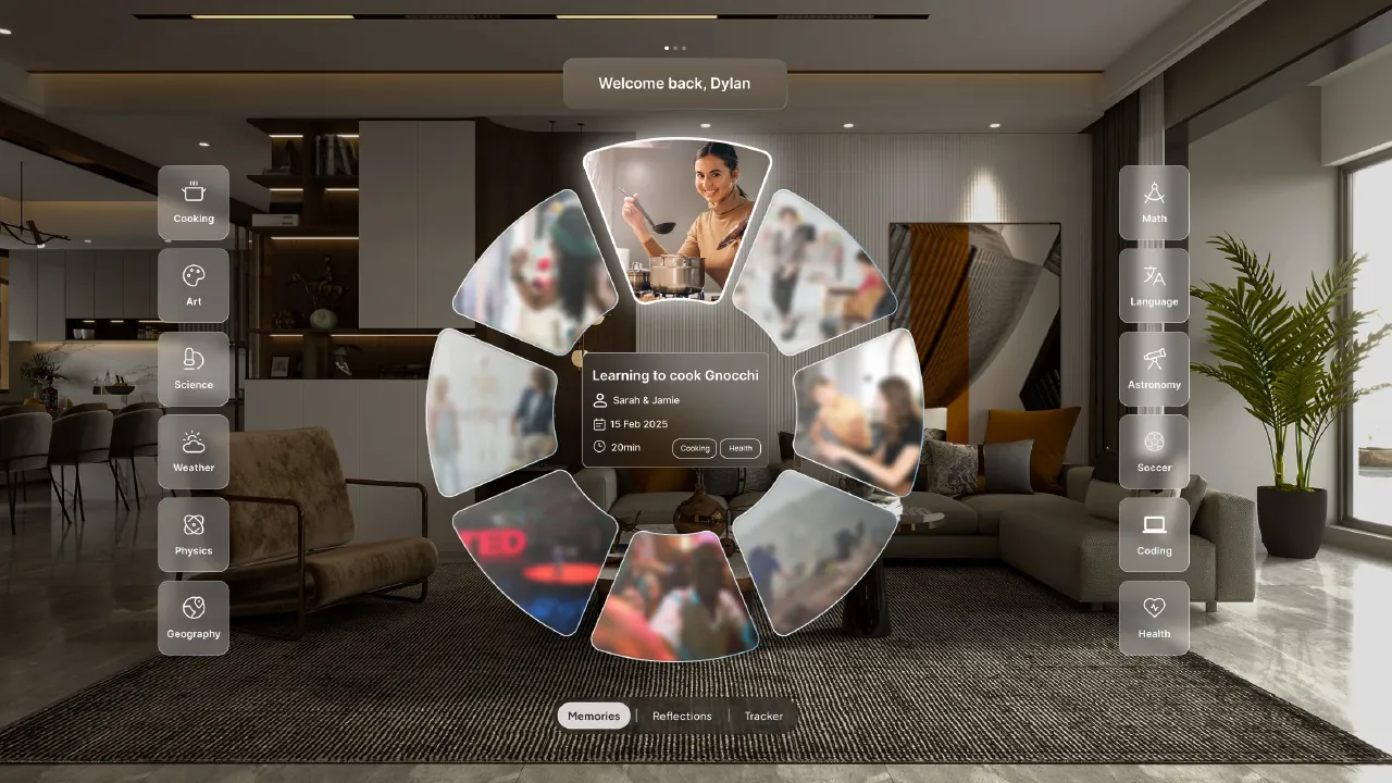
Winks is a speculative superpower, presented as the onboarding deck for "Winks Club, the universe's most advanced superhero academy". Wink three times and a holographic Memory Disk lets you scroll back through time, filter by tags or emotion, and dive into a moment.
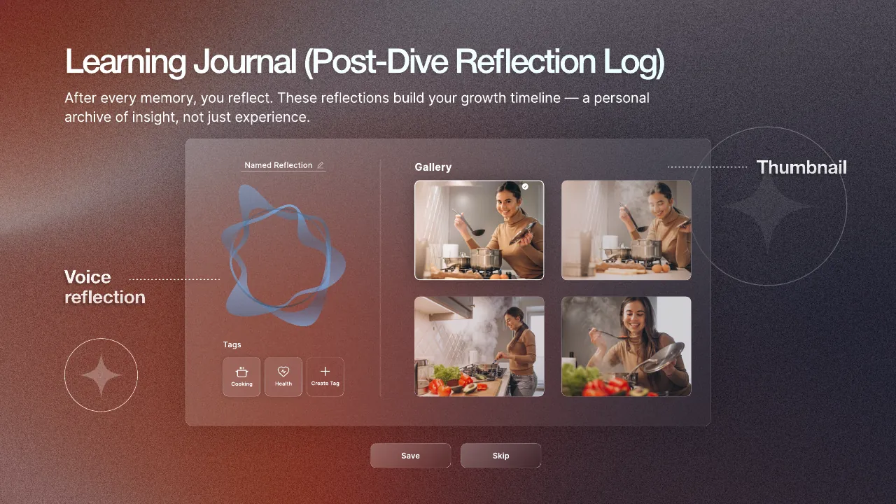
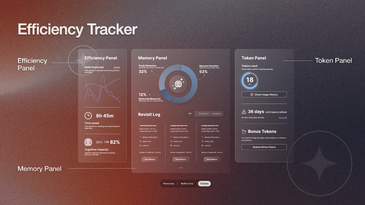
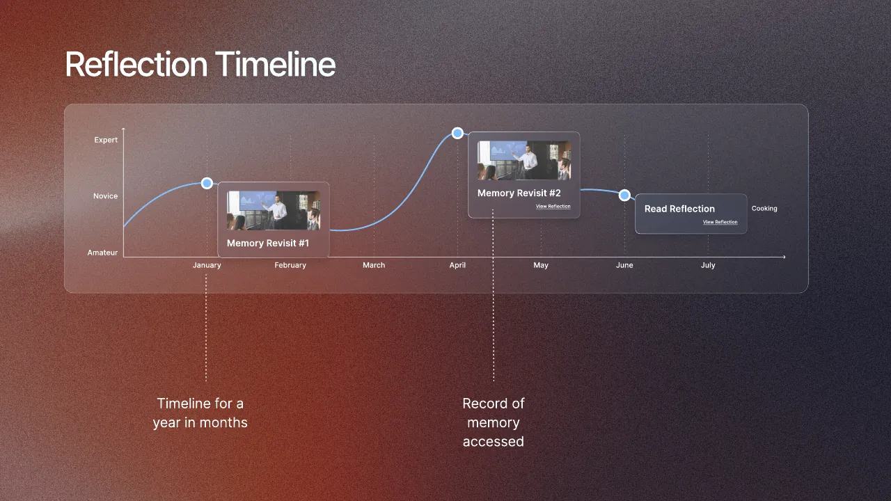
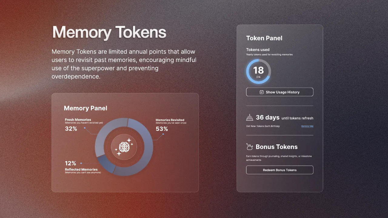
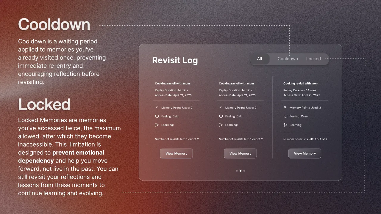
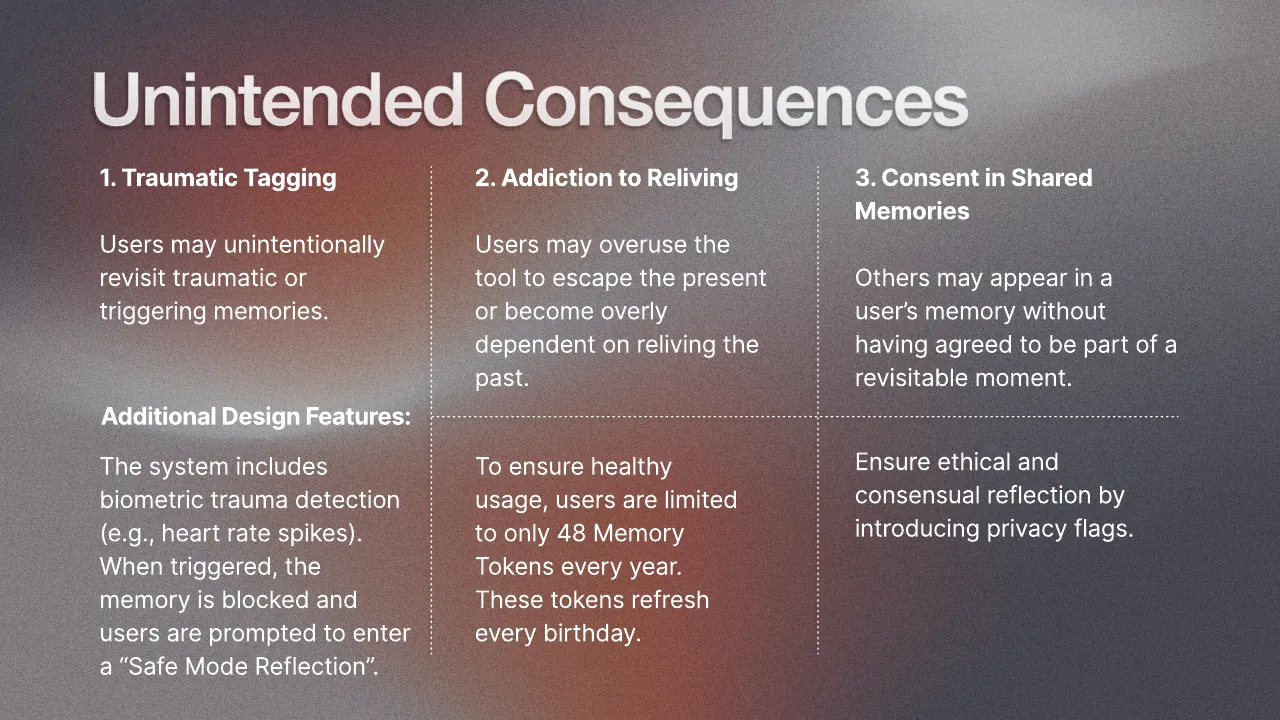
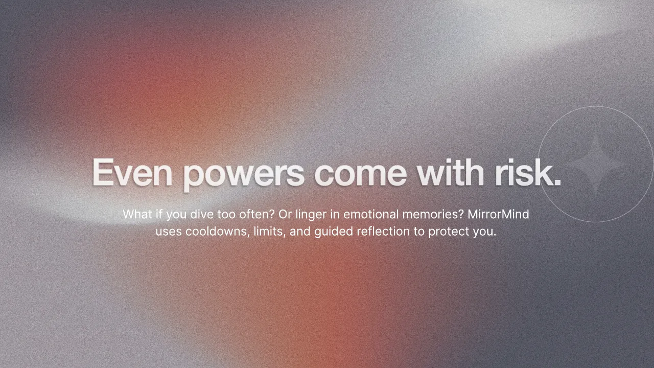
The concept is about learning, not nostalgia. After every dive you log a reflection, which builds a personal growth timeline, and an efficiency tracker shows the skills you gained. Because the power is risky, the design builds in limits: a yearly allowance of memory tokens, cooldowns before re-entry, memories that lock after two visits, and safeguards against traumatic triggers, addiction to reliving, and people appearing in shared memories without consent.